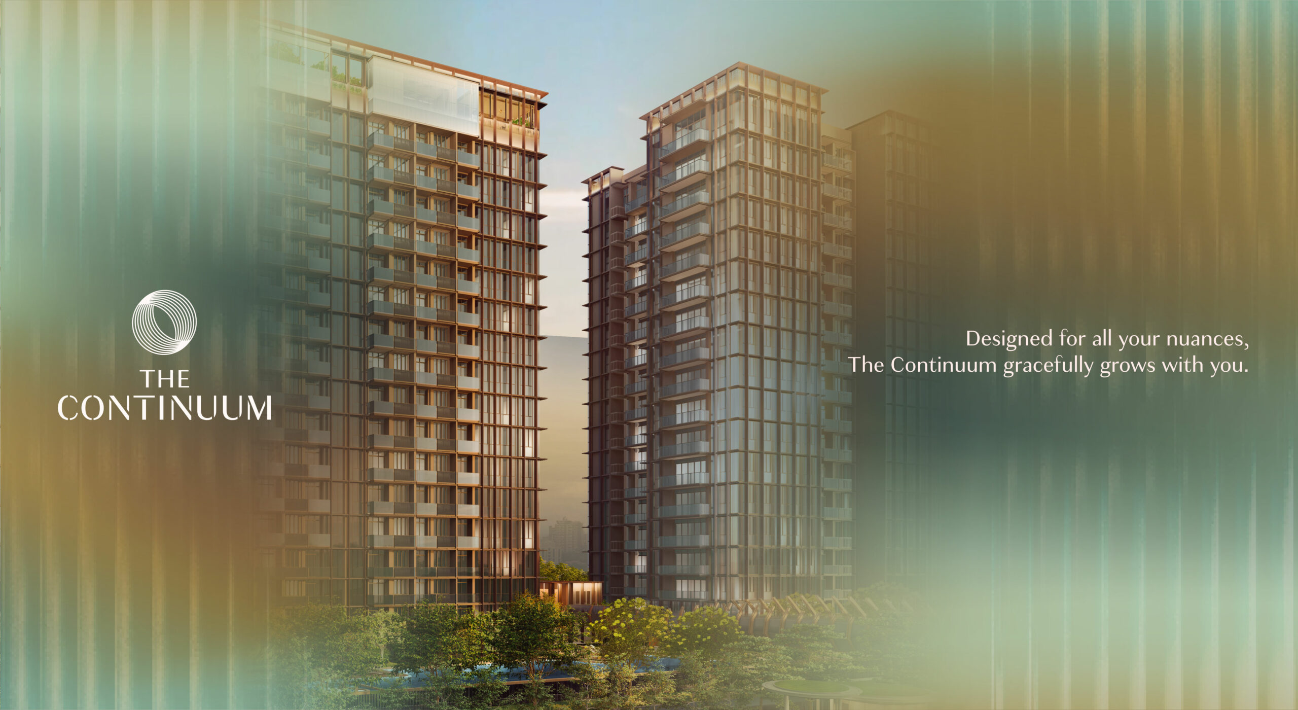
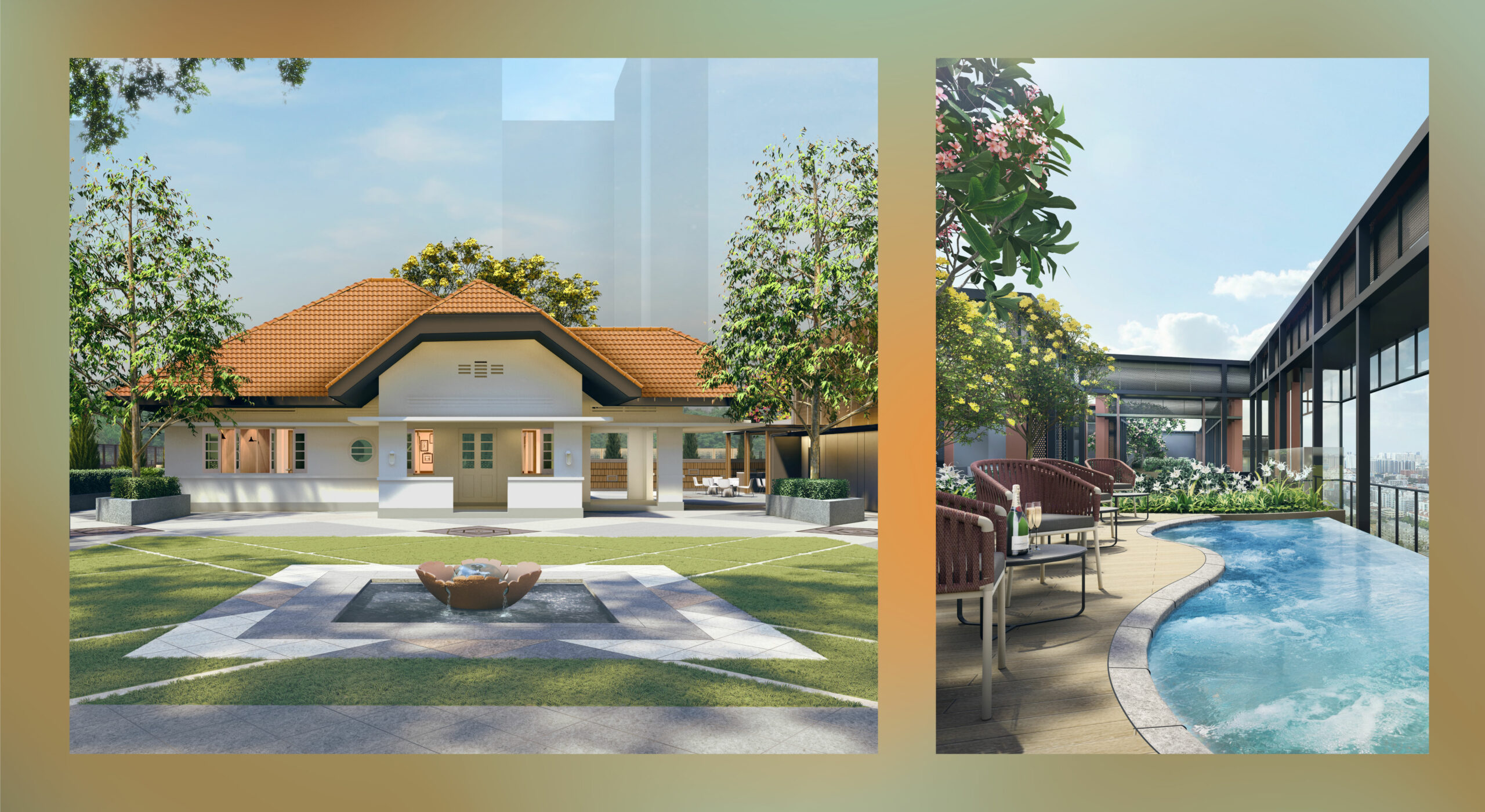
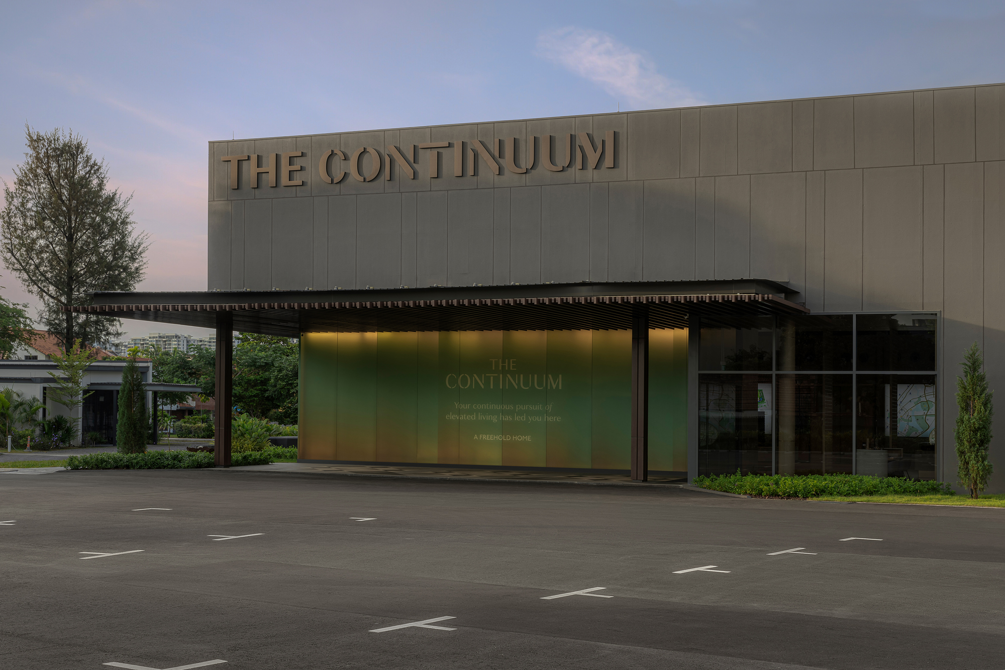
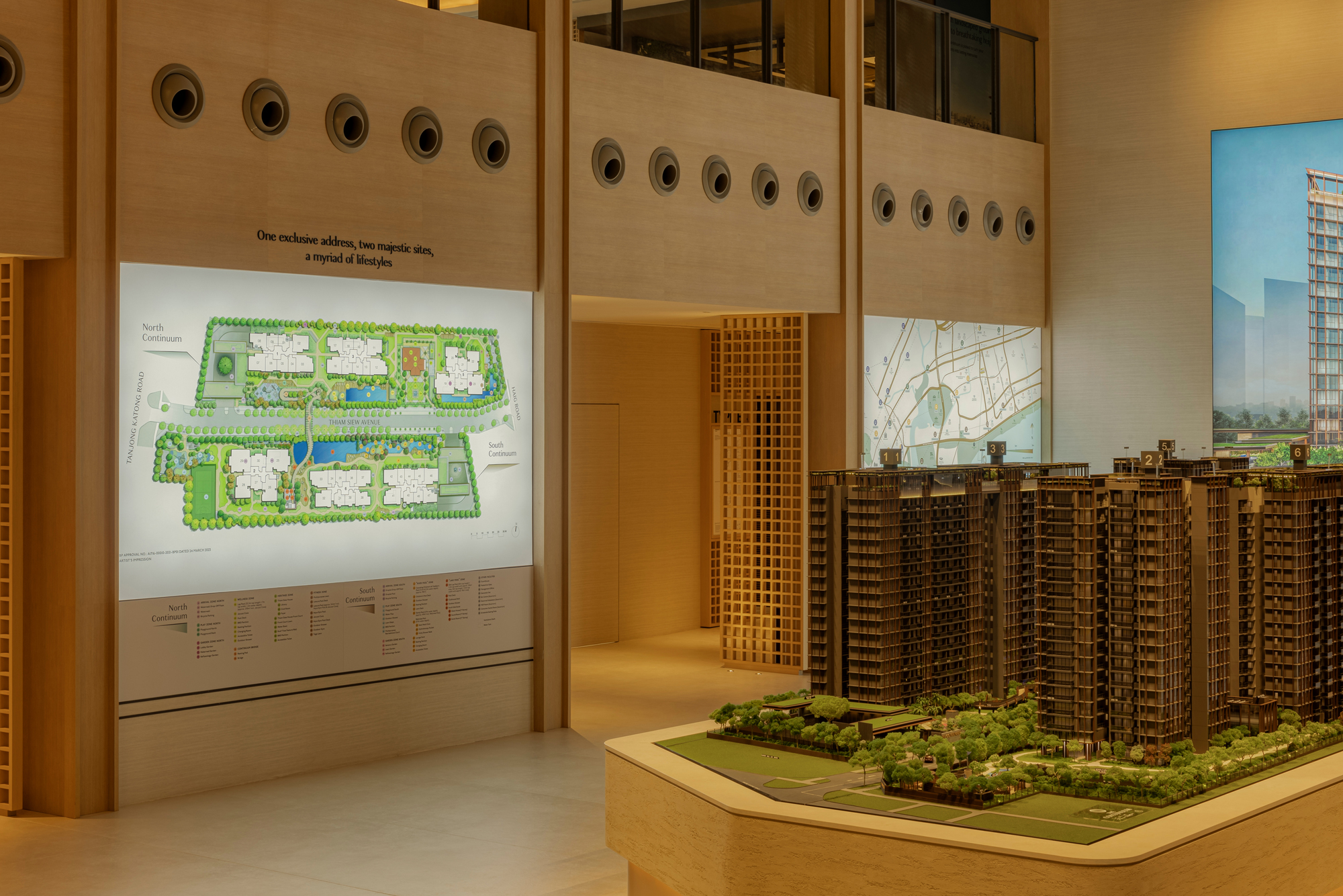
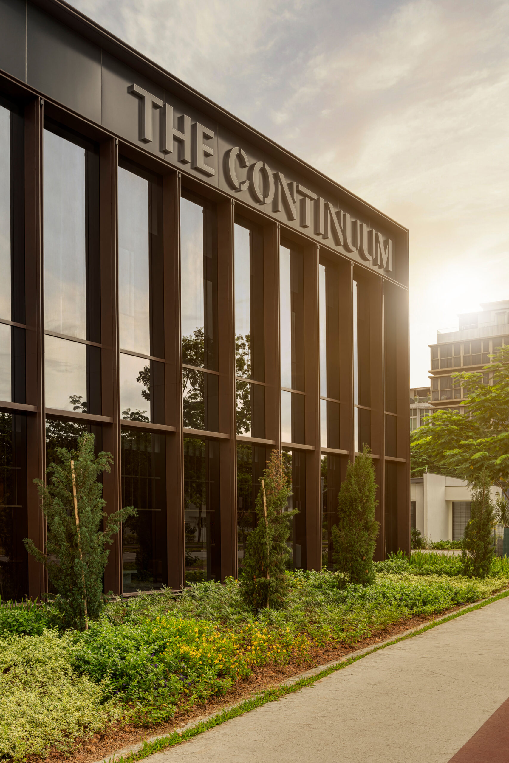
Nestled on the East Coast, at the edge of the city, The Continuum is a rare blend of modern luxury and cultural richness that lets homeowners flow seamlessly between all their lifestyle pursuits. The property sits on two linear parallel plots of land along Thiam Siew Avenue linked by an iconic sky bridge, offering residents a plethora of facilities at both plots for all ages.
The coexistence of these two seemingly disparate worlds is a bold one. Such ambition could only come from the expertise and experience of a joint venture between two established real estate leaders — Hoi Hup Realty and Sunway Property — who invited us to create a brand identity that would encompass their vision for this largest freehold property launch in the East (2023).
Envisioning the brand as a whole, we partnered with Hoi Hup Sunway on various touch points including the logo, typography, sales brochure, social media content strategy and creation, and sales gallery collaterals for this large-scale residential project.
Where Everything Begins with Endless Possibilities
Continuum means continuous, progression or uninterrupted flow. Upon researching, we were intrigued by how the property offers unique lifestyles both within the property and beyond in the neighbourhood. Taking inspiration from the rich site heritage and natural environment of the nearby coast, we strategically devised the property’s brand positioning as “Seamless Living Redefined”.
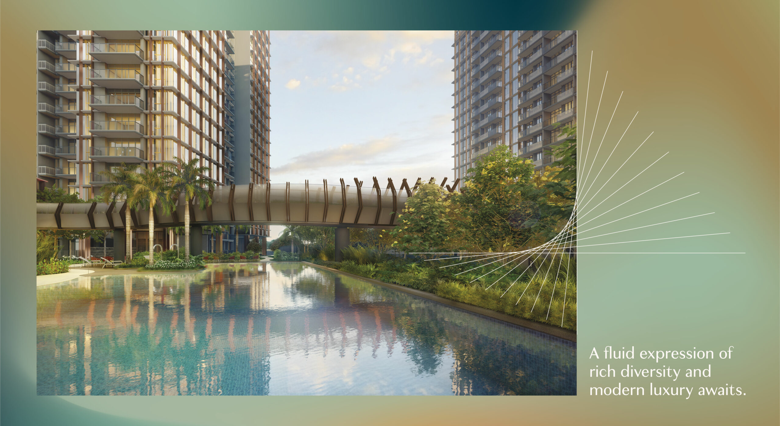
Rather than simply highlighting the contrast between the lifestyles that the property offers, we wanted to showcase how residents can breeze between all their lifestyle pursuits using the iconic bridge as a symbol of transition – from heritage to new age; tranquillity to revelry; jubilation to rejuvenation. This ethos of “seamlessness”, “continuity” and “uninterrupted flow” guided our thinking and creative execution to distill across the entire project.
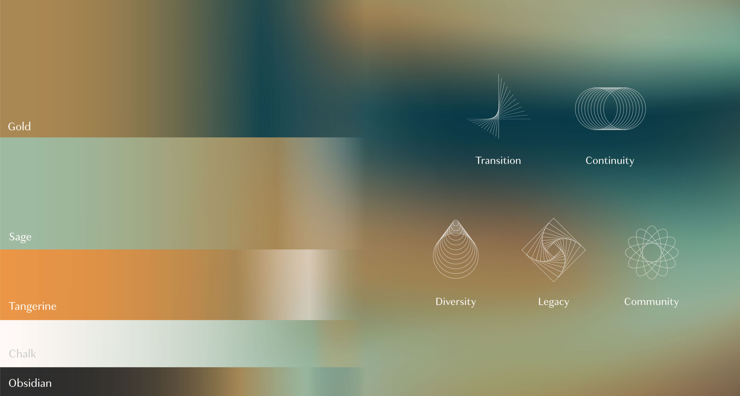
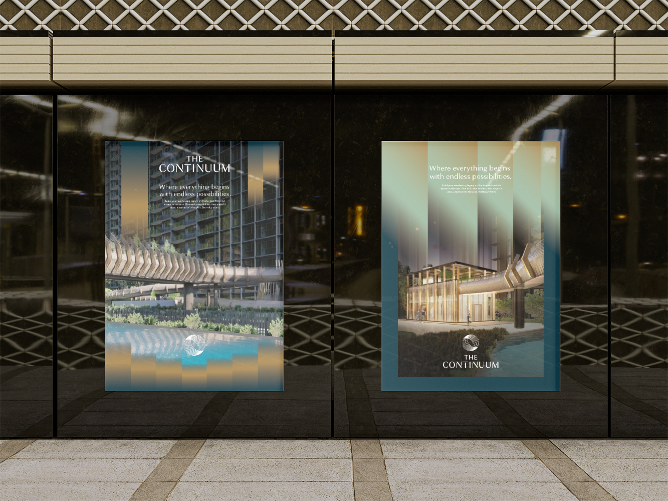
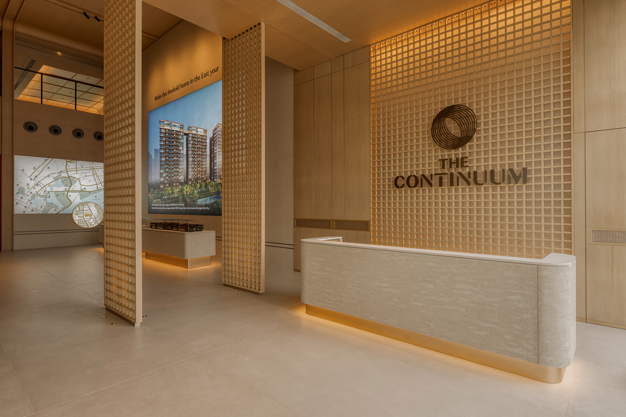
Striking a balance between timelessness and modernity, our art direction features gradient earthiness and geometric, clean-cut forms. Drawing from the building’s architectural style, The Continuum logo is a classic sans-serif wordmark incorporating a harmonised blend of varying strokes. The stencilled treatment suggests the property’s emphasis on allowing its residents to savour every in-between moment through its well-crafted design and experiences
The logo symbol is a reflection of the letter ‘C’ stylised with rhythmic lines to mimic the infinite possibilities at The Continuum. The lines feature contrasting widths, overlapping to form movement within the design as one goes through the ebbs and flows of life.
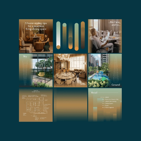
Similarly, the logo symbol’s style was adapted into a series of five graphics to represent the values of the property. These graphics were applied through the various collateral offerings from social media, large-scale hoarding and advertising.
Every Stage Elevated
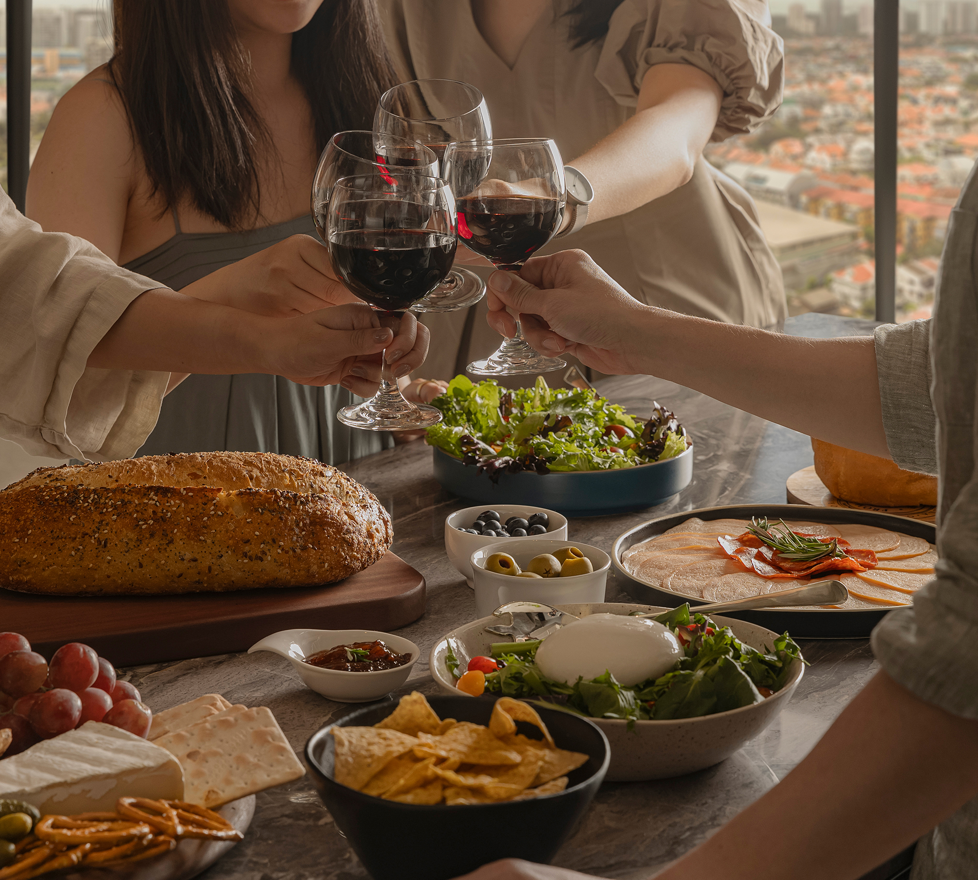
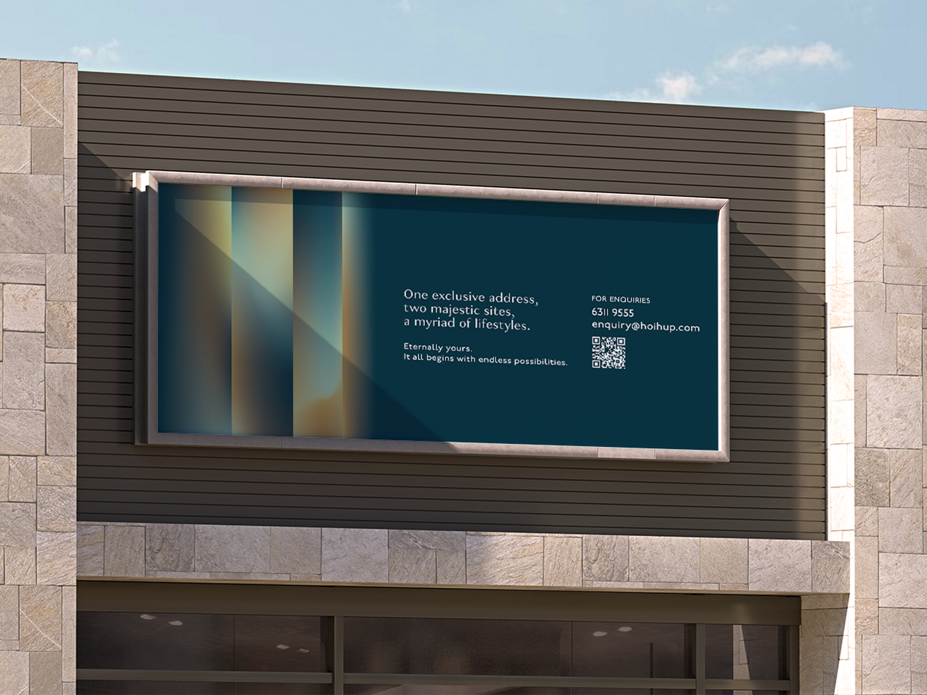
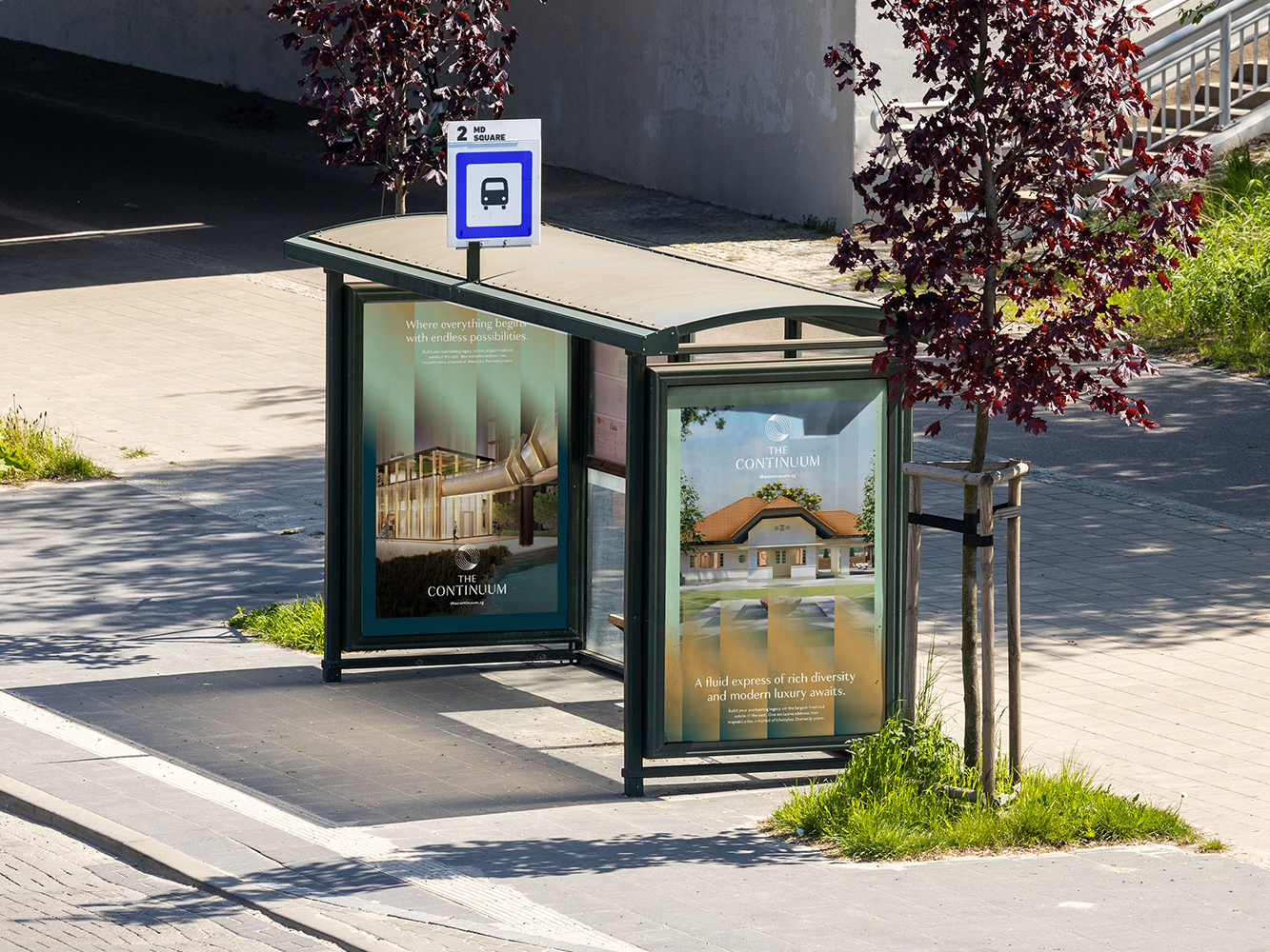
With the visual system established, it was applied across a wide range of marketing collaterals that were featured island-wide. From print, digital ads and out-of-home advertising, special care was taken to evoke a warm invitation for viewers to come visit the property.
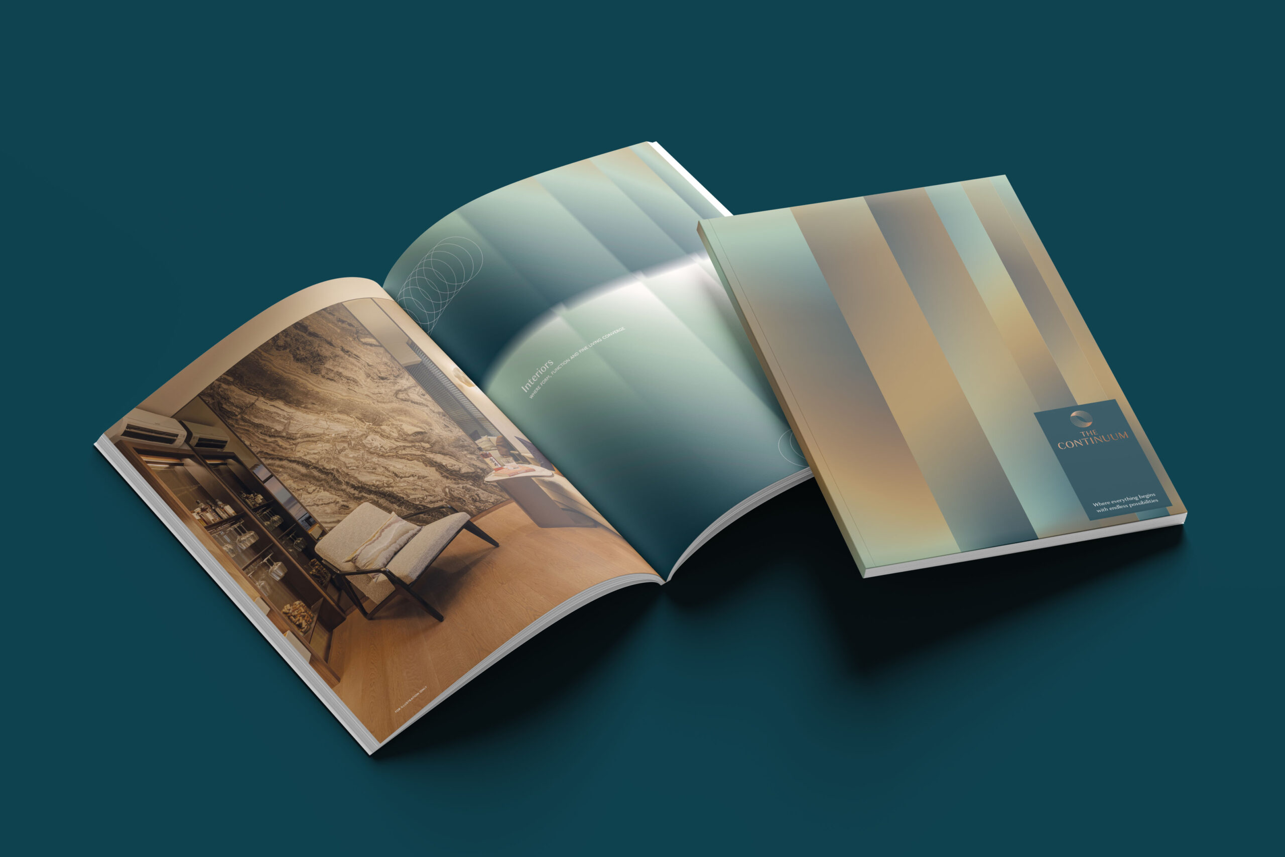
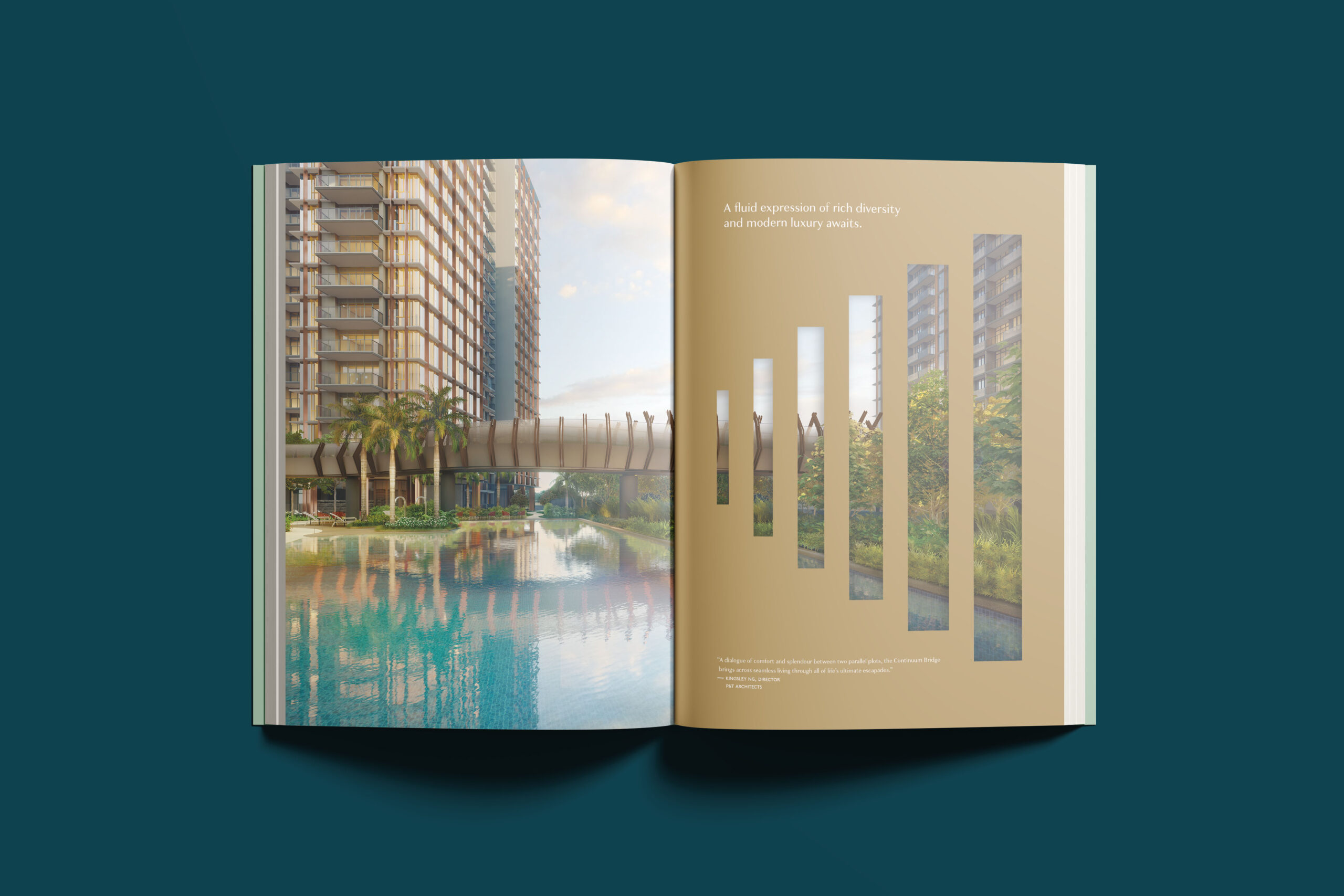
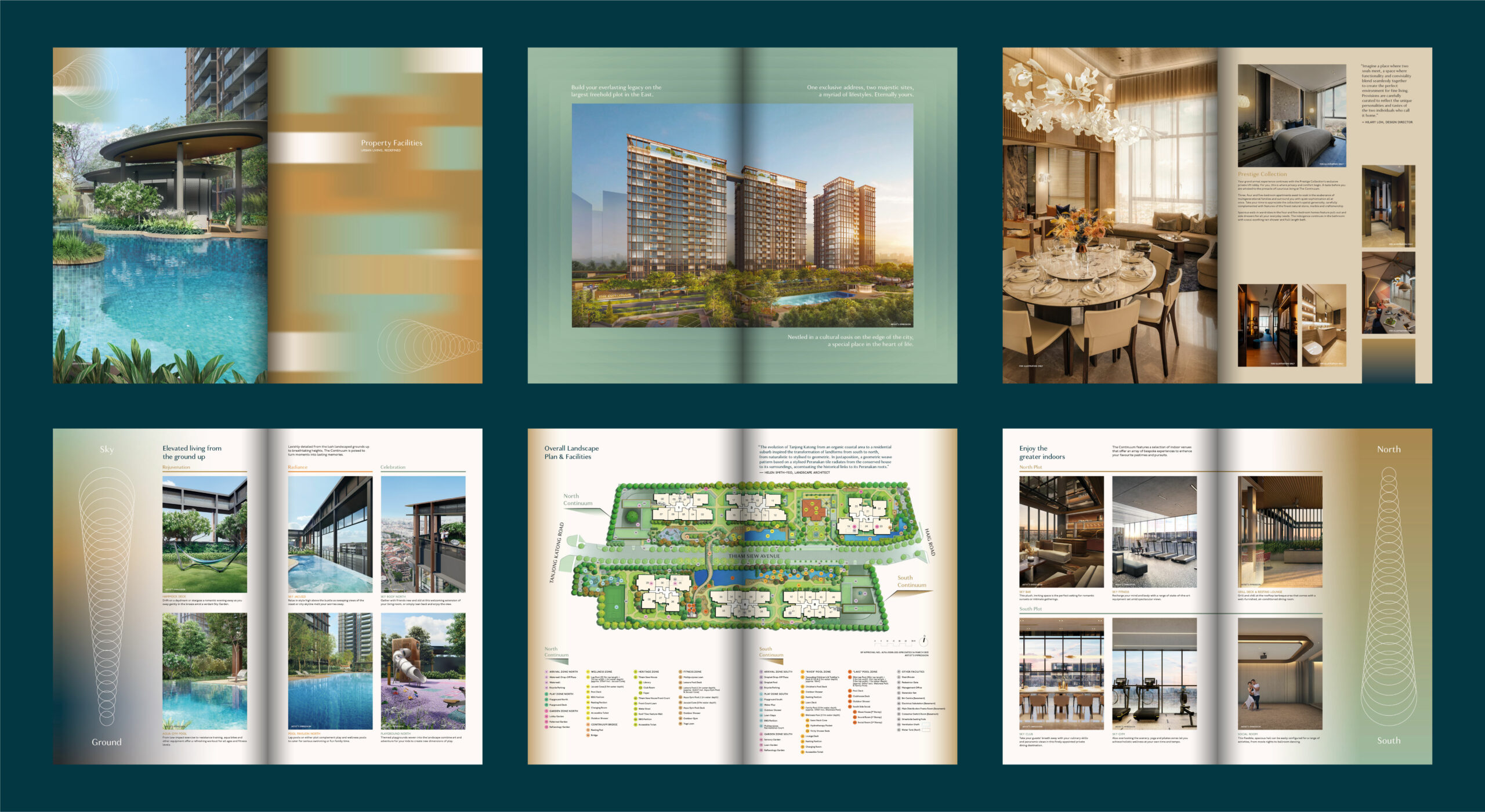
Flipping through the brochure, viewers could read through the content brimmed with textural patterns and tactility with its finishings. An added touch of personality intertwined the pages with the use of sleek graphical elements and geometric cut-outs to showcase the neighbourhood’s old-world charm and cityscape.
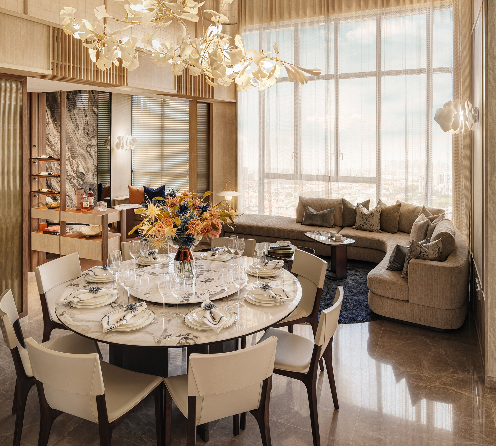
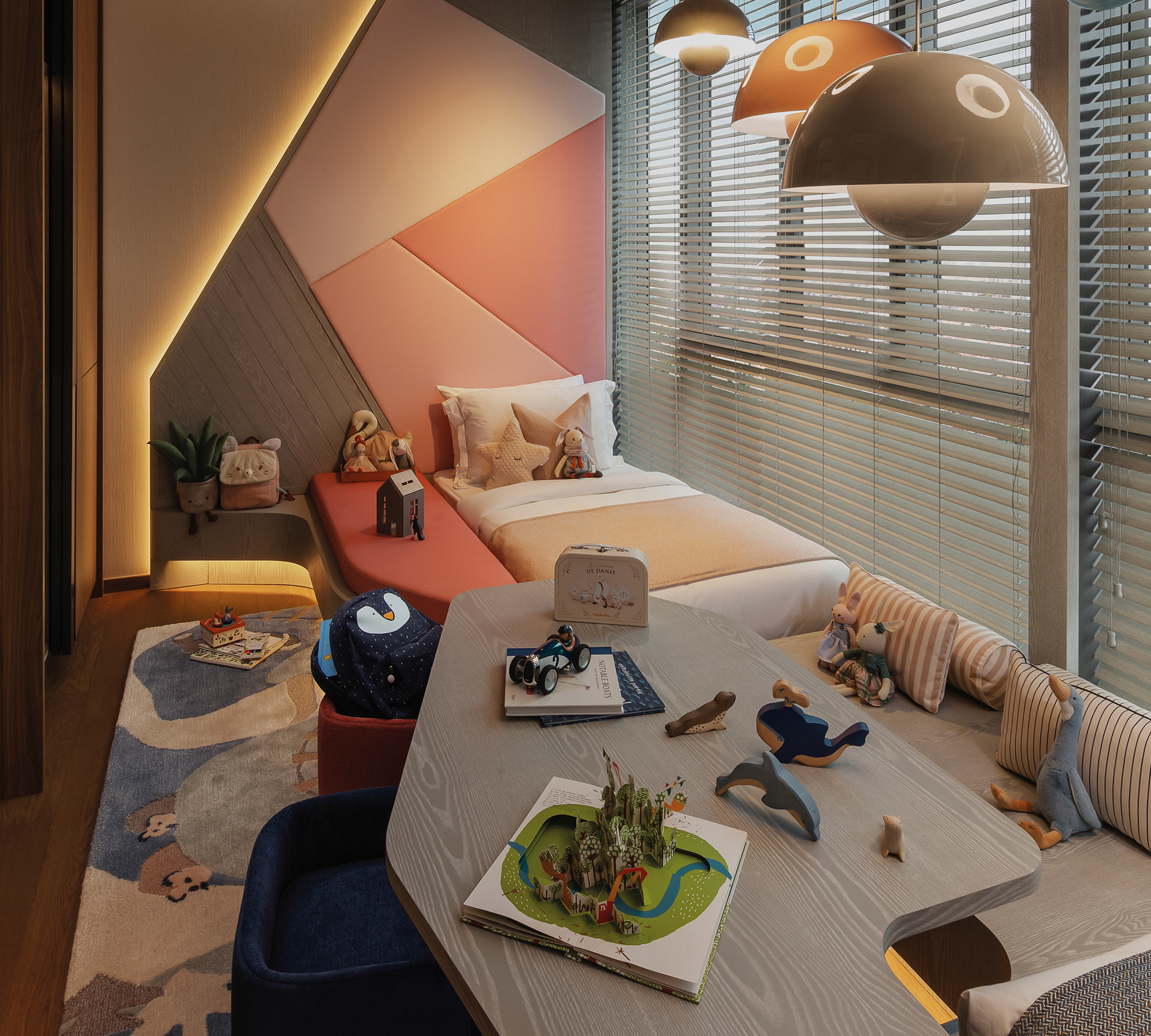
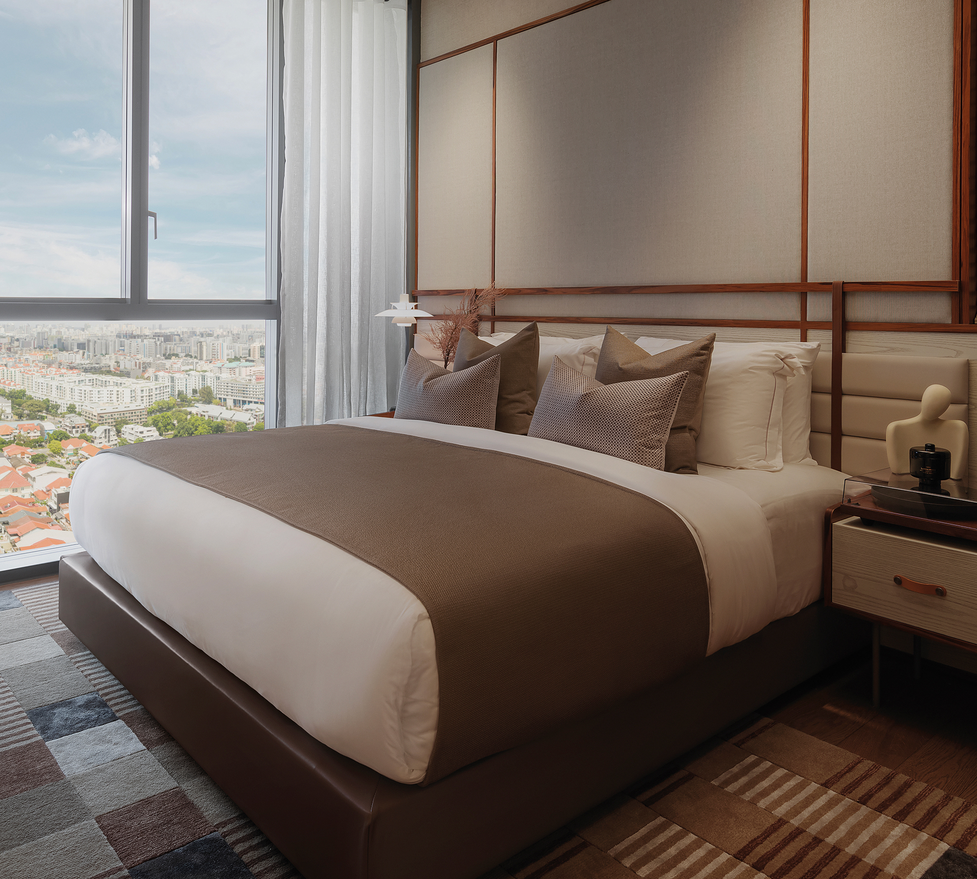
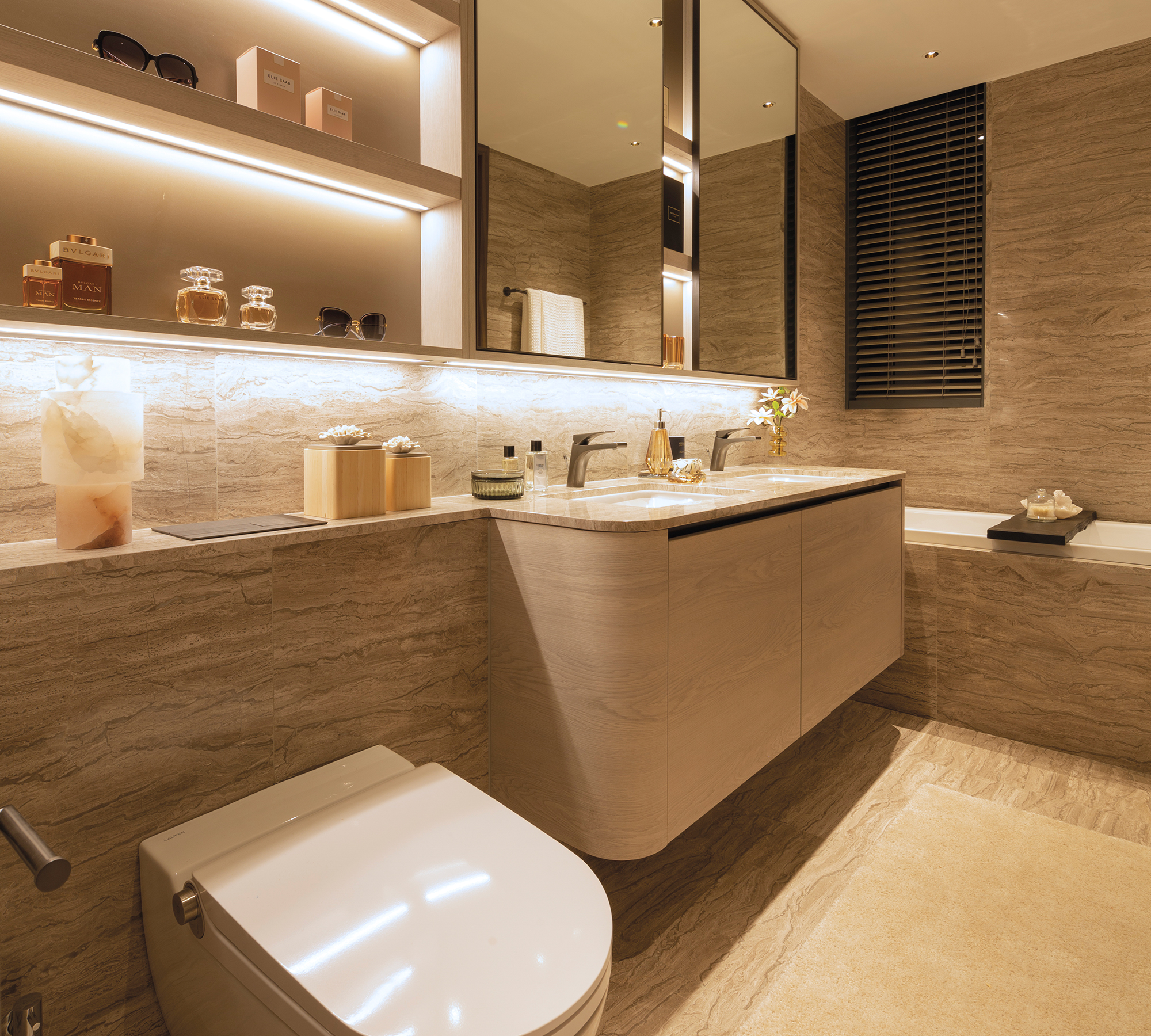
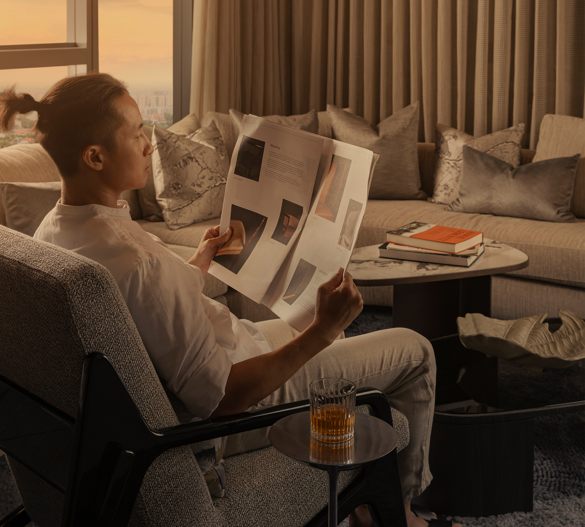
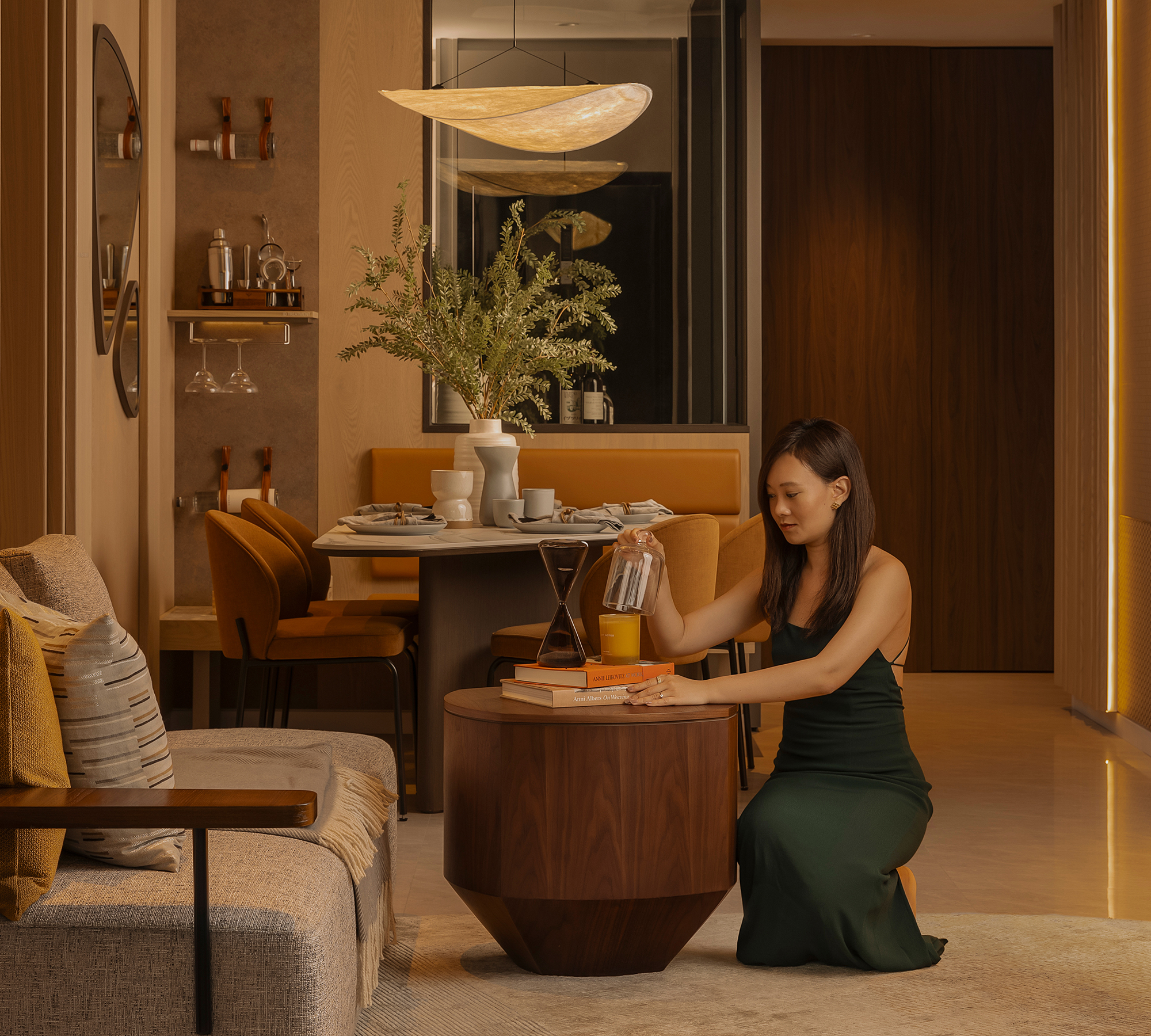
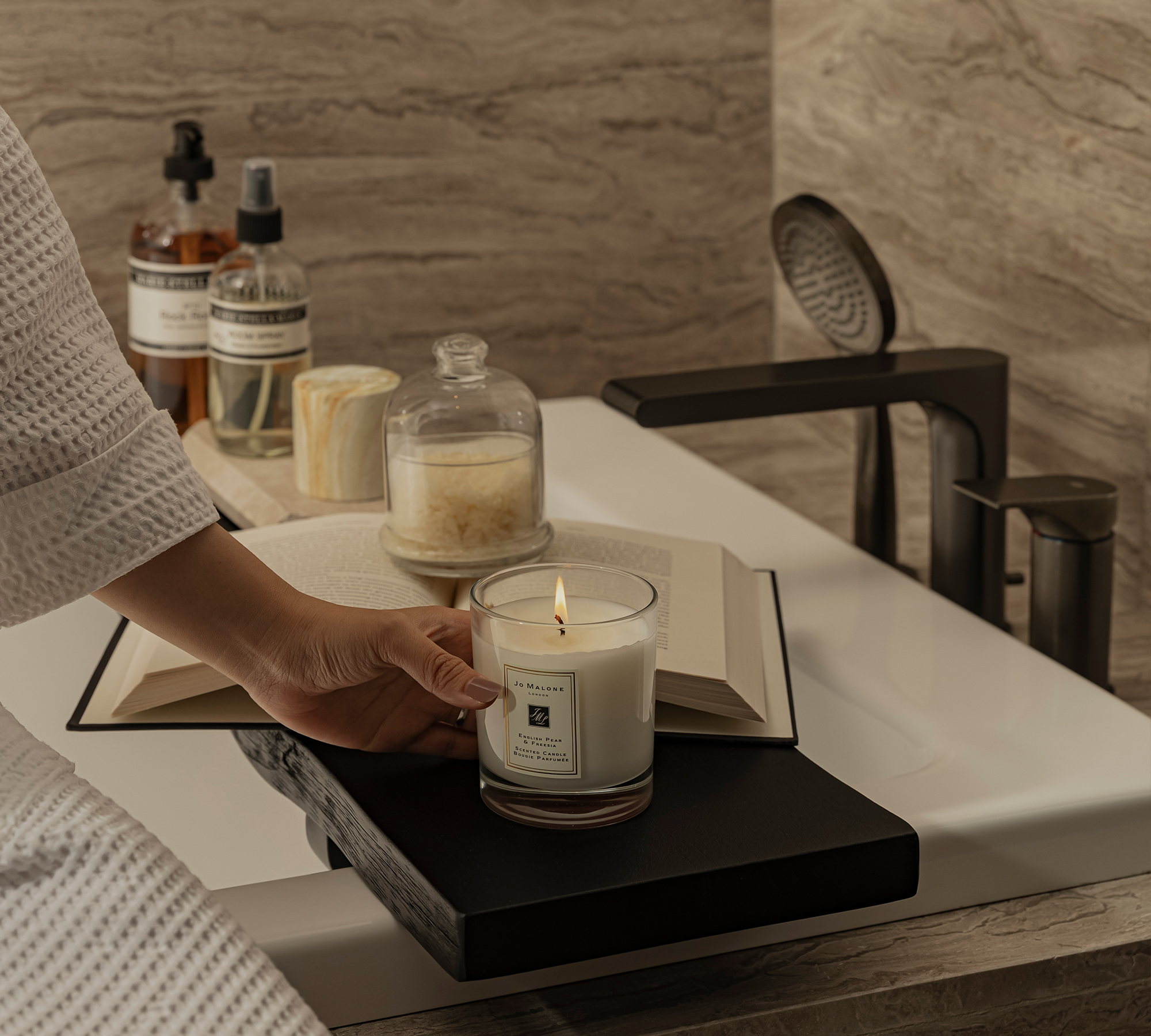
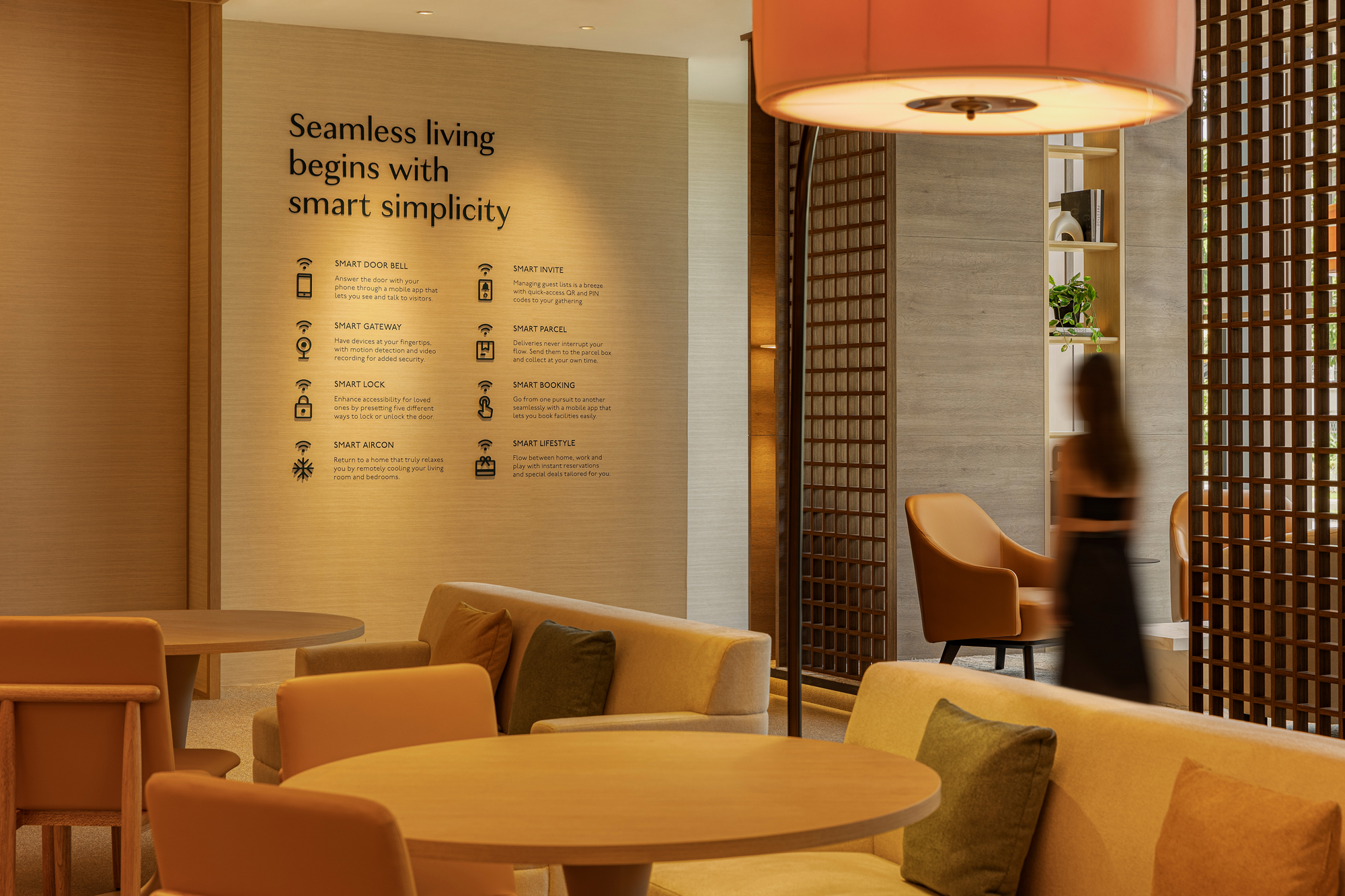
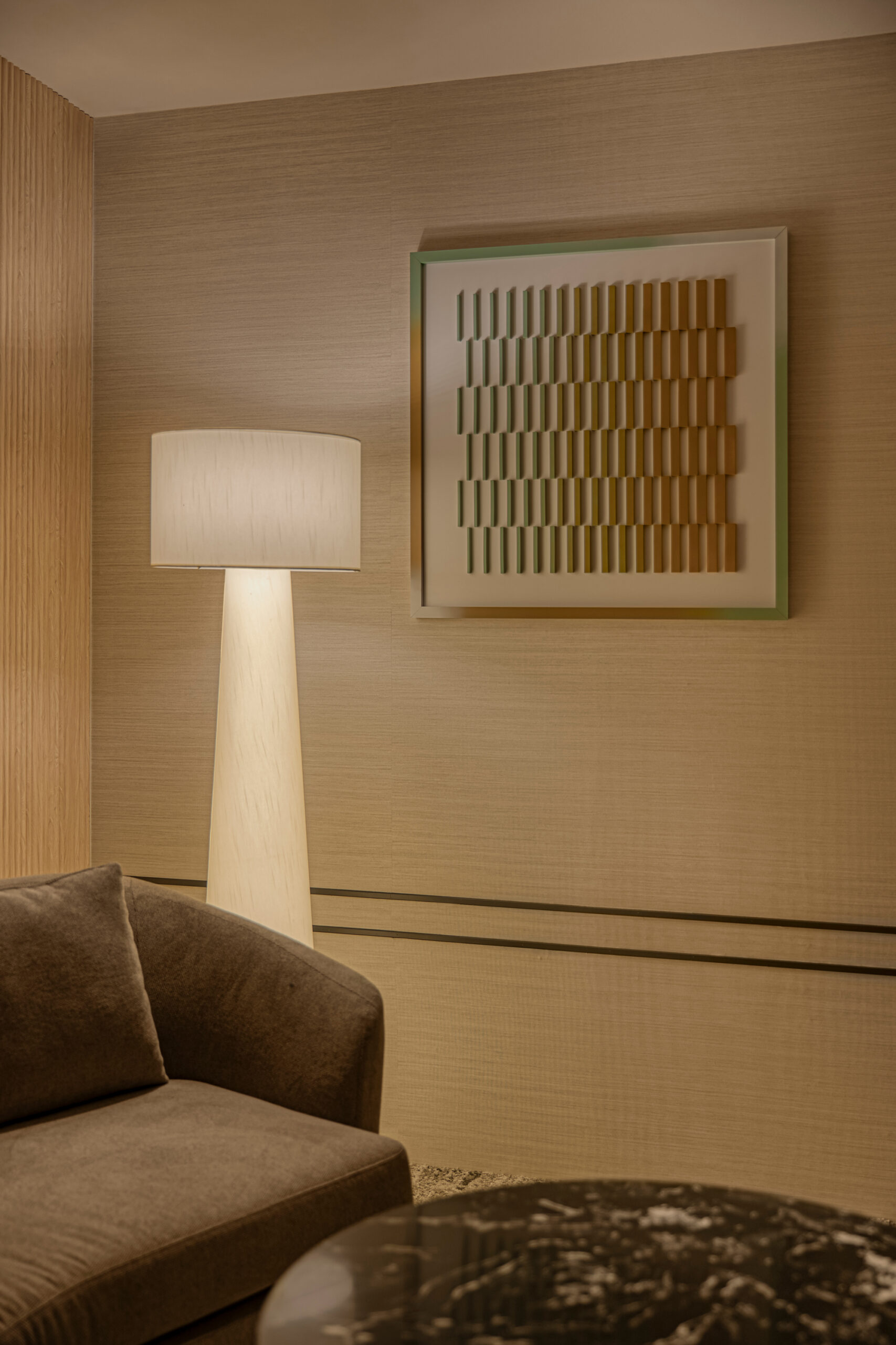
The designs were also translated spatially with the show flat collaterals, where various touchpoints were activated throughout the space. Areas such as faceted artworks and large-scale wall panels strengthened the showflat’s presence, while still letting the renders of the property amenities take the spotlight.
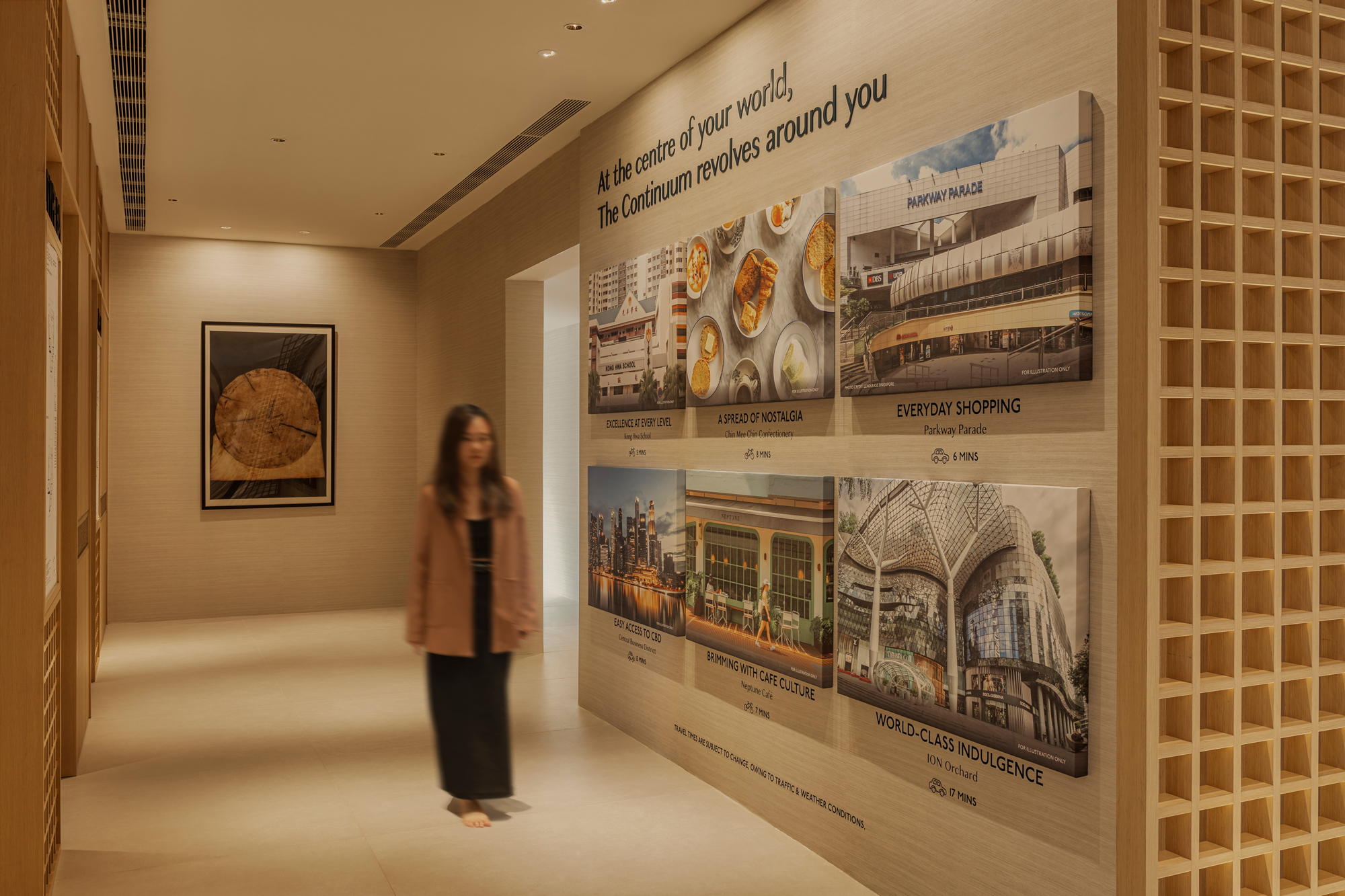
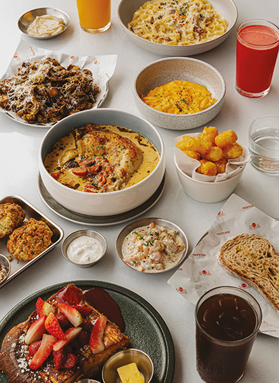
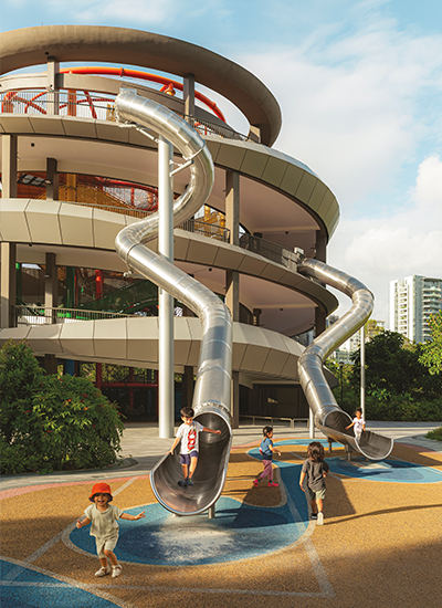
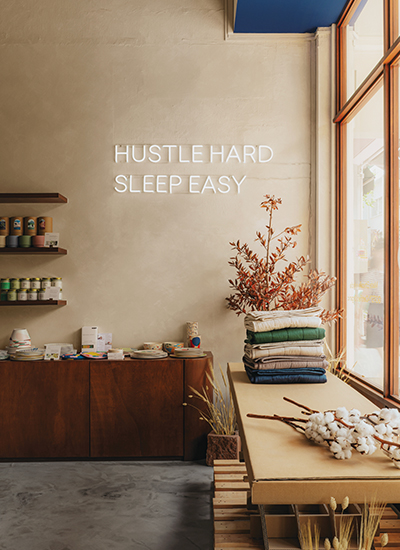
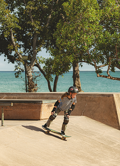
Another consideration was The Continuum’s social media platforms, where we strategised how to best show off the branding. A tasteful curation was needed to pique viewers’ interest with its unique features. Guided by this idea, content pillars were devised to strategically showcase the best aspects of the property—Brand, property, lifestyle and neighbourhood.
Building an Everlasting Legacy
By taking a bolder approach, The Continuum owned its positioning of Redefining Seamless Living for Generationswith self-assured confidence. With the property’s launch, the roll-out of the marketing campaign captured attention with its tone of voice and design.
"Overall, the creative & tonality is definitely very different from the usual project launches where it takes on a more hard-sell approach on the amenities and project size. We do like this fresh approach as it projects The Continuum (and Hoi Hup) as a luxury & premium brand and elevates the standing where it fits the Freehold property status.”
— Hoi Hup’s Digital Agency Consultant
We are honoured to work with the multi-talented team of Hoi Hup Sunway as they continue their journey to provide living spaces of the highest quality, comfort, functionality, and style.
Creative Direction, Art Direction, Brand Identity, Publication Design, Collateral Adaptation, Social Media Content & Design
OuterEdit
Photography
Nic Loh
(Art Directed by OuterEdit)
Print Production
Allegro Print