Rehabilitation that
Renews & Empowers
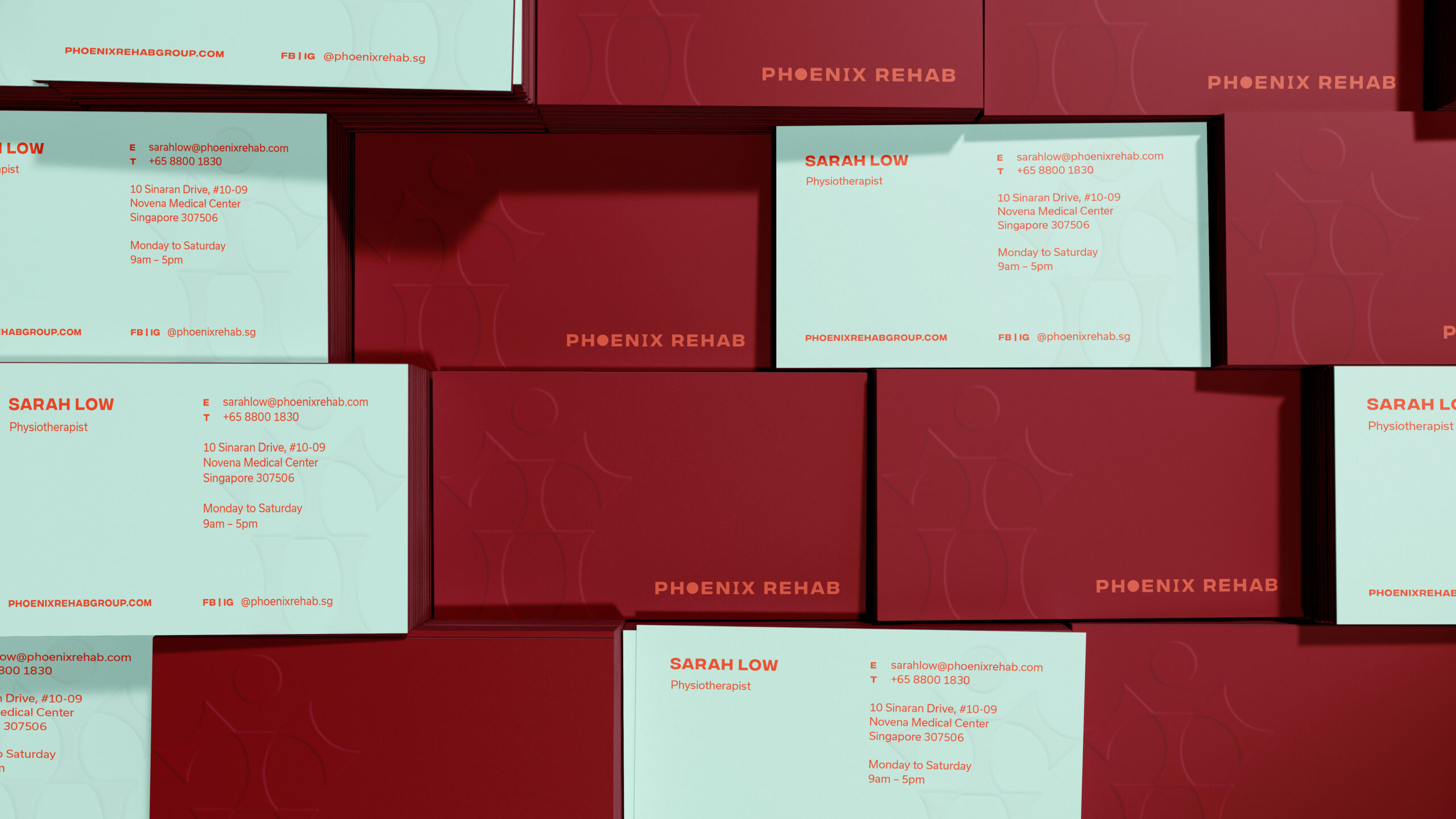
Brand Strategy — Graphic Design
Phoenix Rehab
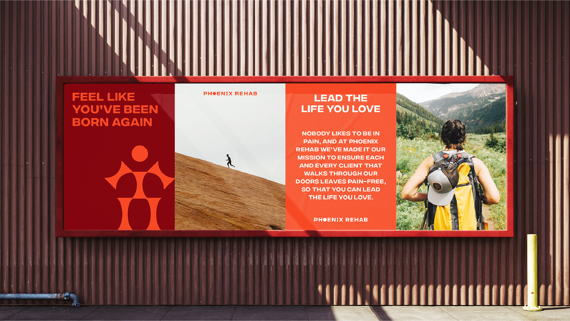
Phoenix Rehab is a multi-disciplinary rehabilitation clinic that offers an integrated approach to pain and injury rehabilitation with the aim of helping each and every client that walks through their doors leave pain-free. Leveraging on the name's aspirational tone, we created a brand identity with distinct messaging that empowers individuals to feel renewed and born again, enabling them to lead the lives that they love.
sASasas
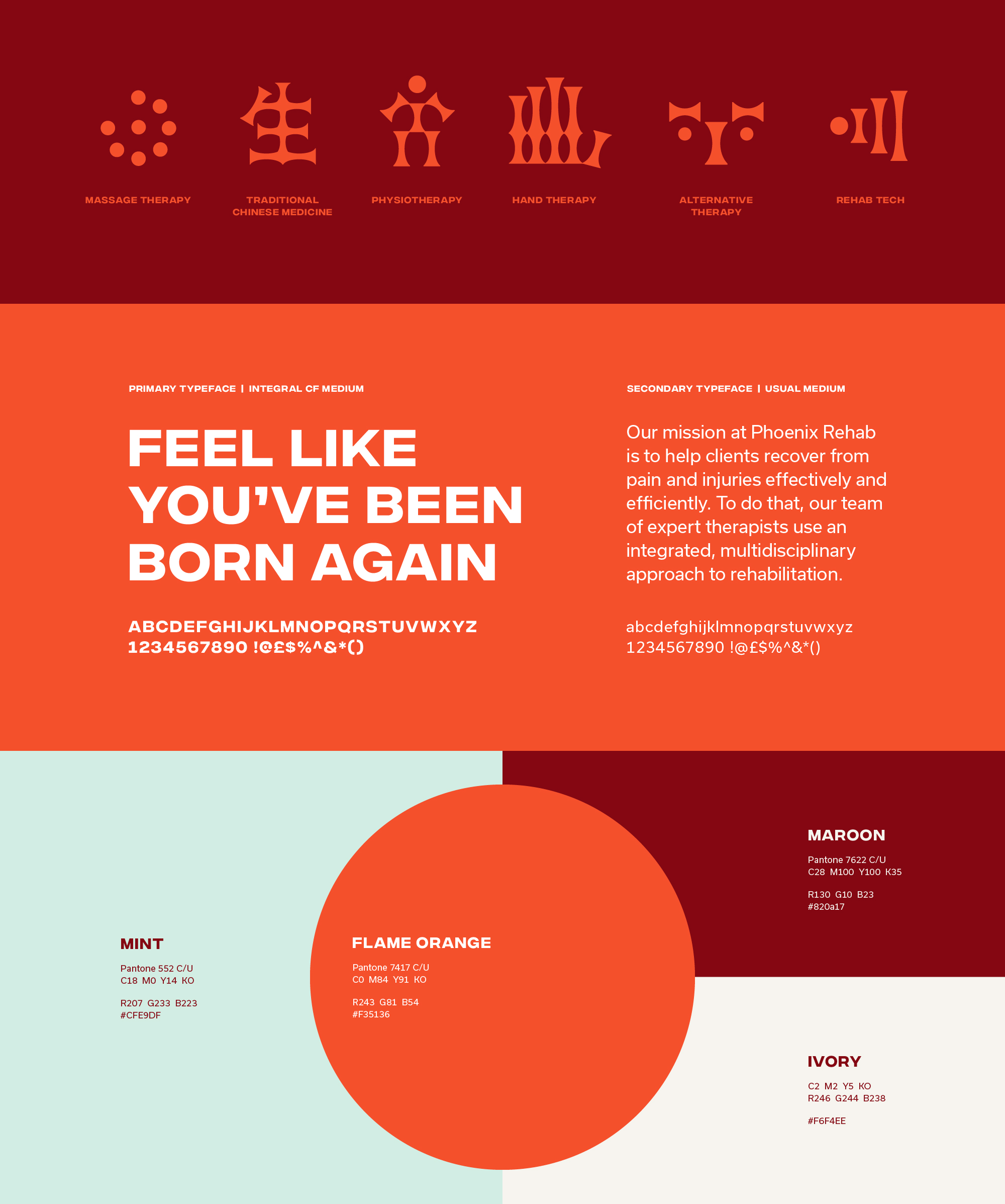
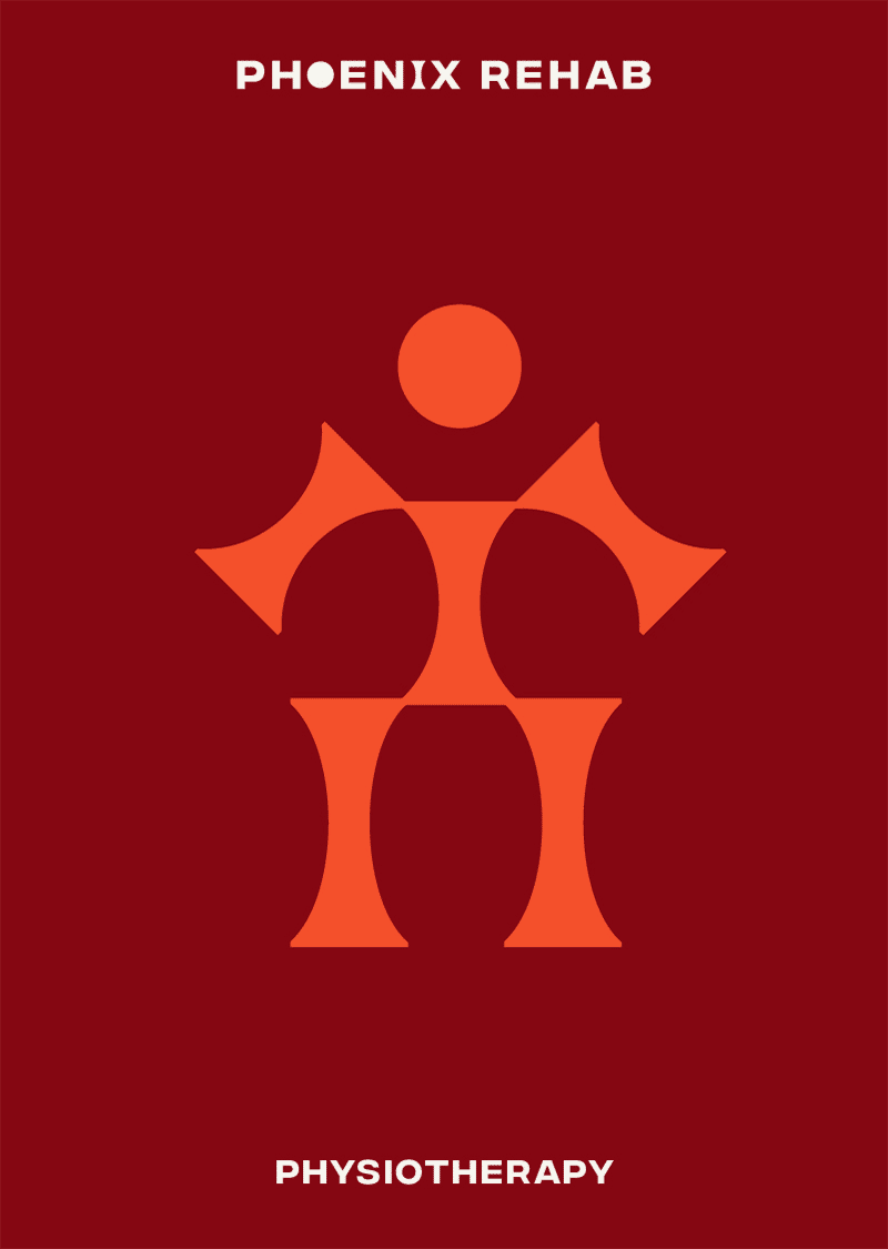
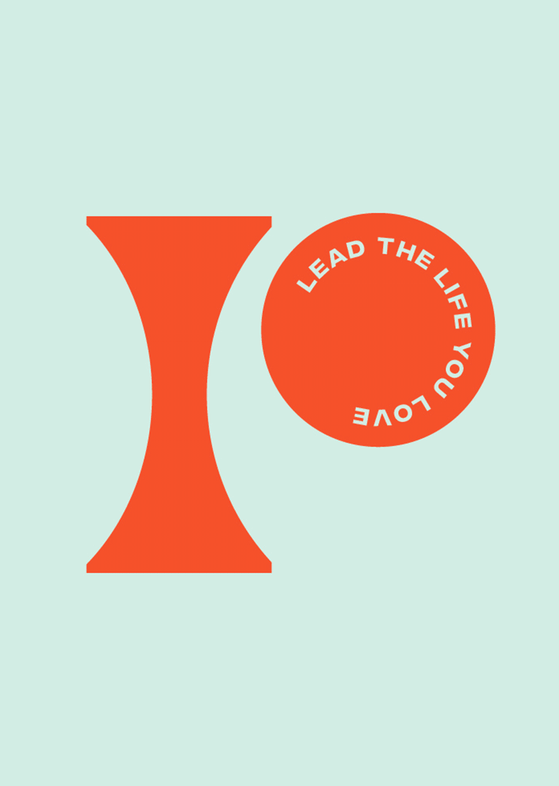
Taking Inspiration from the Human Anatomy
The brand identity and graphic system draw inspiration from the fundamental structure of the body, which is created with many connecting links and anchor points that work together and operate in tandem.
The brand's key elements comprise of two main shapes, a circle, and a pillar, as its main building blocks. They are used dynamically in both the primary and secondary logos, as well as graphical icons.
Lead The Life That You Love
In contrast to the serious and sterile image that clinics tend to carry, we decided to do things differently with Phoenix Rehab and create an empowering, lively, yet dependable personality for the brand. We feature curated and invigorating imagery, bold typography, and inspiring graphics in both digital and physical touchpoints to inspire clients as they journey toward recovery.

Creative Direction, Art Direction, Graphic Design & Development by
OuterEdit