A New Experience On A Classic Favourite
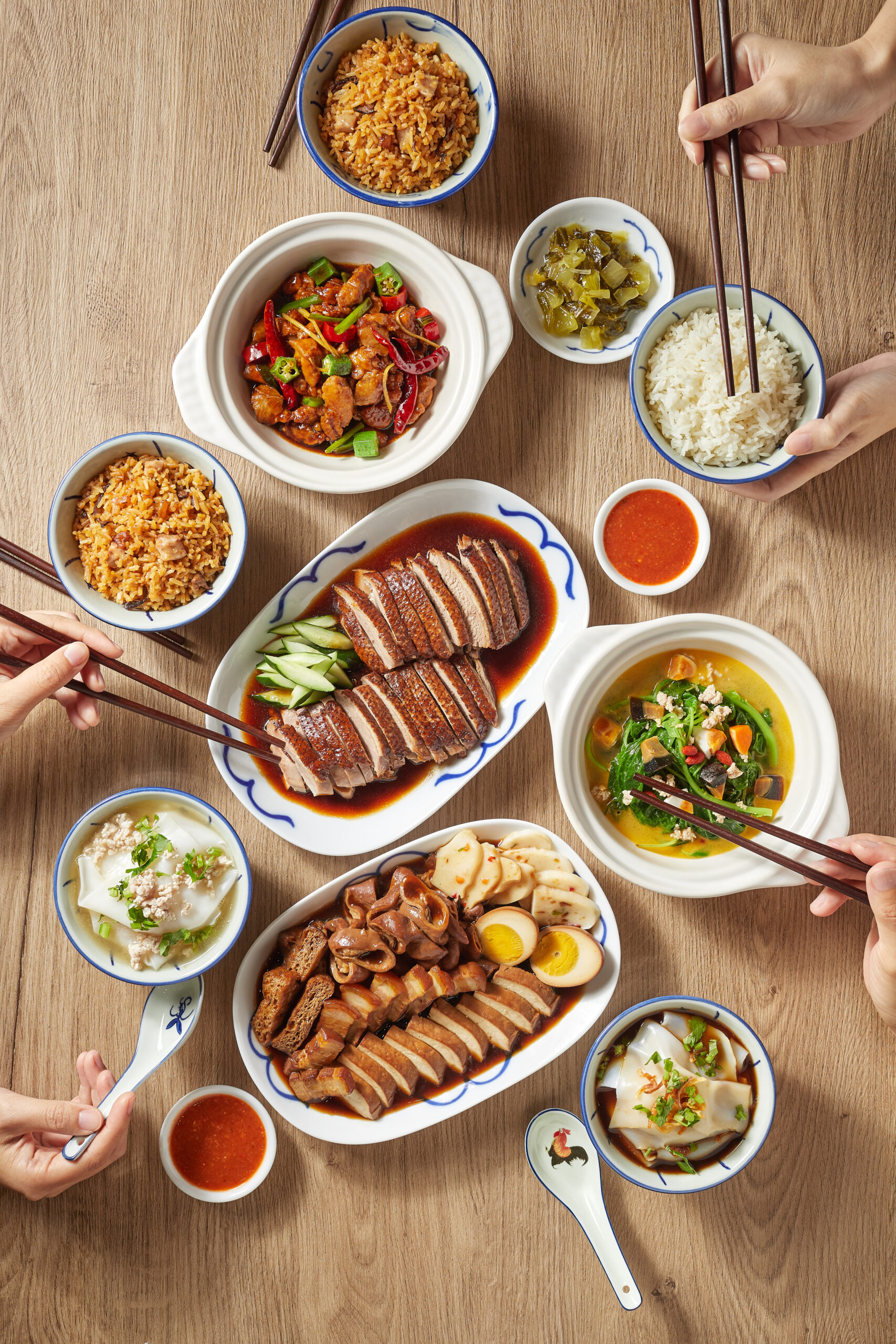
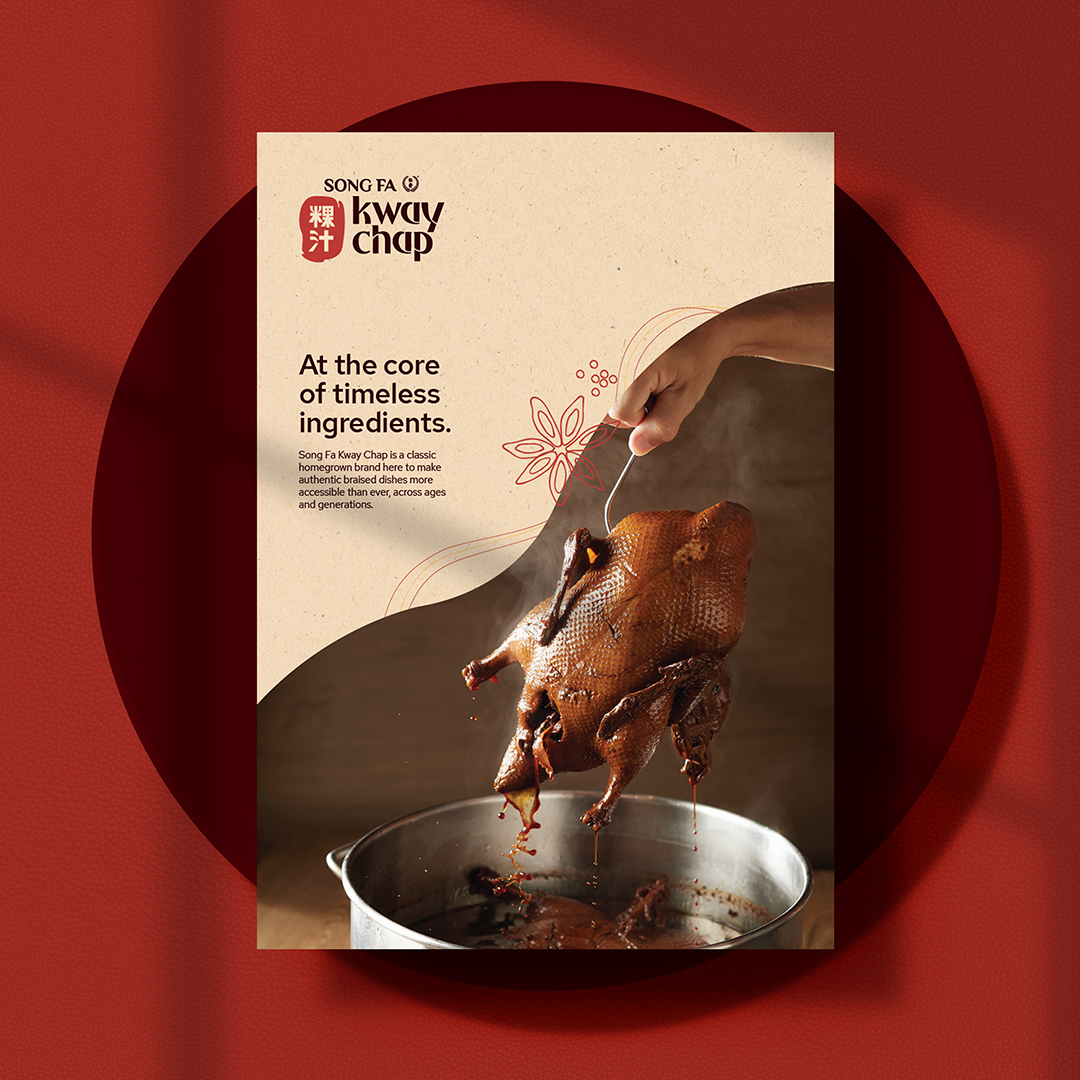
From the original Michelin Bib Gourmand family, Song Fa Kway Chap is a homegrown brand with an aim to make authentic braised dishes more accessible across ages and generations. Every dish on its menu is faithfully adopted from, inspired by and innovated upon Madam Tan’s (wife of Song Fa's founder, Yeo Eng Song) original recipe since 1975. While winning over countless smiles of approval among the older generations with its signature taste, it positions itself to appeal to modern diners through a refined experience, easy-to-order menu and an accessible, effortless self-order concept.
We partnered with the recognisable F&B group, Song Fa, once again to create a brand identity and visual system for Song Fa Kway Chap that resonates with younger generations, yet stays true to its roots.
Cooking Starts From The Heart And Follows A Feeling
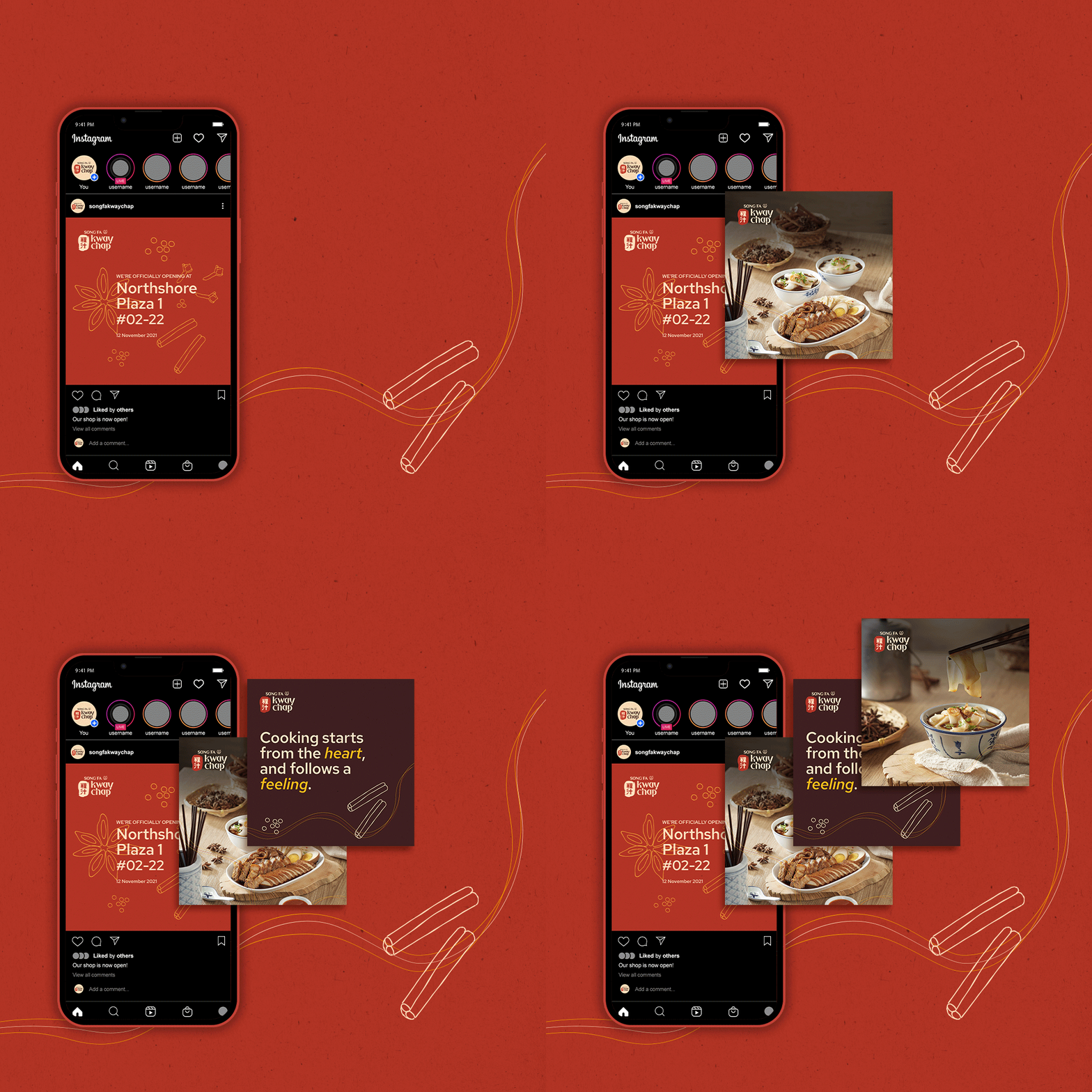
Inspired by Madam Tan's (wife of Song Fa's founder, Yeo Eng Song) experimental cooking style anchored on timeless ingredients and cooking based on feeling, we developed an approachable brand narrative for Song Fa Kway Chap that exudes warmth, homeliness and heritage with a modern twist.
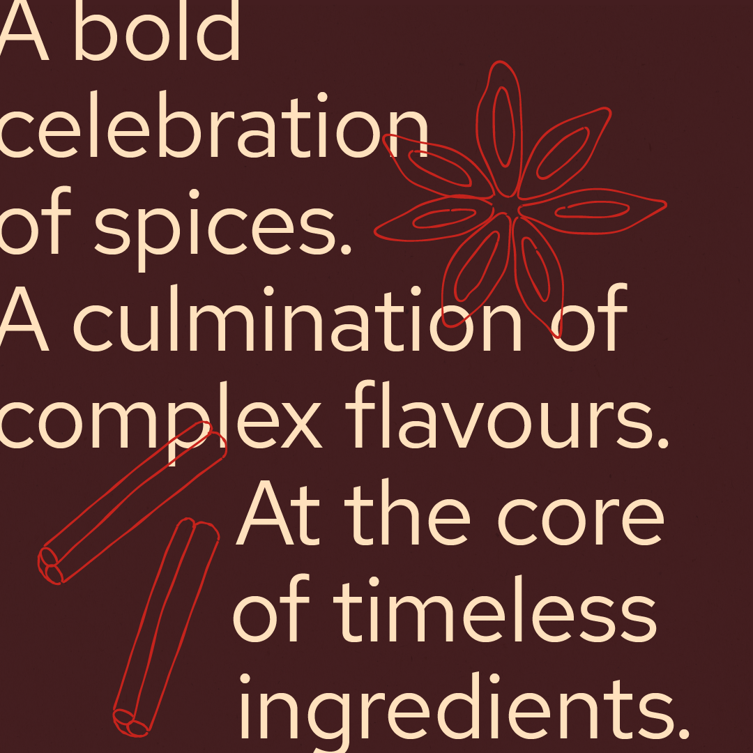
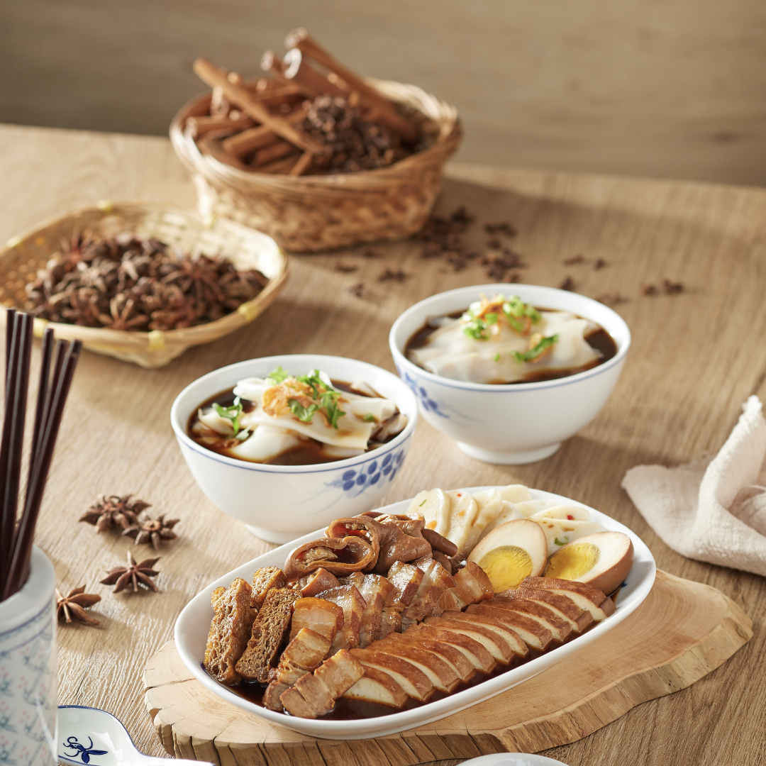
The concept also stems from the bold celebration of spices and culmination of complex flavours that Madam Tan fuses to create an intimate slow braise. We wanted to capture the intermingling of different spices, ingredients and flavours, all coming together layer upon layer in a warm, comforting bowl of Kway Chap, accompanied by braised dishes in a dynamic visual system that speaks of tradition and modernity.
Traditional Roots As Key Driving Force
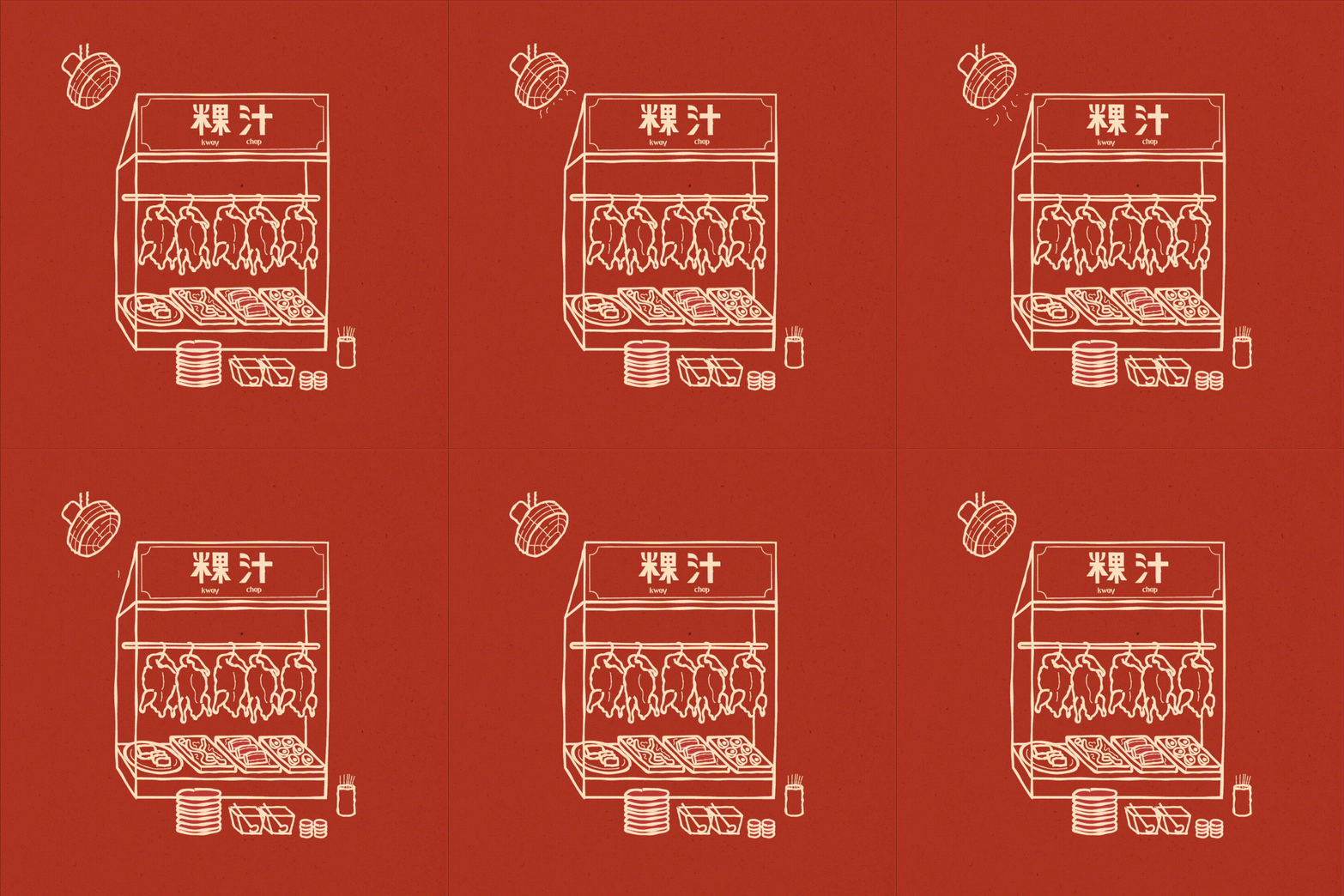
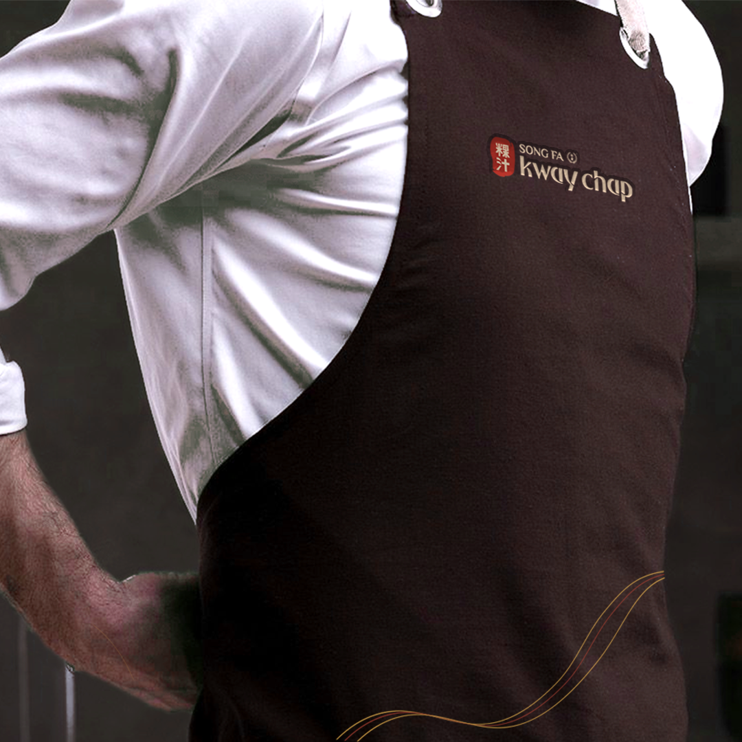
The logo design features a customised Chinese logotype with clean edges for a modern look, yet placed on a seal stamp to showcase Song Fa Kway Chap’s commitment to delivering authentic flavours rich in heritage. The English logotype is inspired by the folds and curves of the Kway, which is the staple in all Kway Chap dishes.
The brand colours are based on the original brand colours of Song Fa to create a dependable look, while retaining brand recognition. The rest of the colours are inspired by the hues of the Kway Chap menu – braised savoury stock, succulent duck, springy intestines, tender and juicy pork and chilli sauce. A custom-illustrated set of spices were also created to further narrate Madam Tan's emphasis on using timeless ingredients and impactful flavours.
Simple, Point-to-order Menu Format
Expanding from the design of the Song Fa Kway Chap brand identity and visual system, we rolled out a range of collaterals and in-store touchpoints. The menu specifically is designed to appeal to the young and on-the-go crowd who might find it intimidating and inconvenient to order Kway Chap at the usual hawker centres. It is designed to be simple, accessible and straightforward with curated and easy-to-order set meals for self-ordering and fuss-free collection.
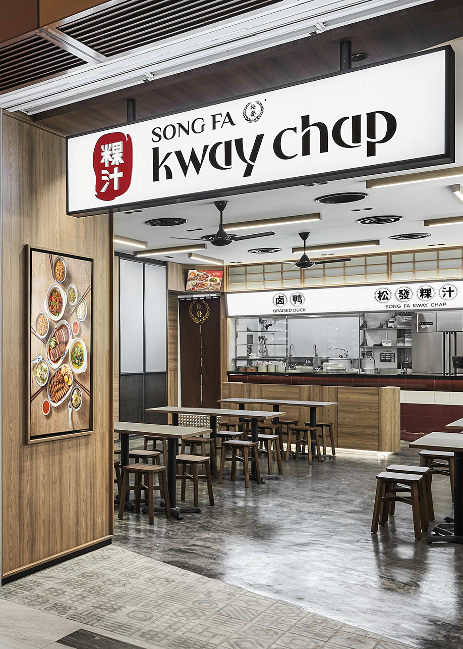
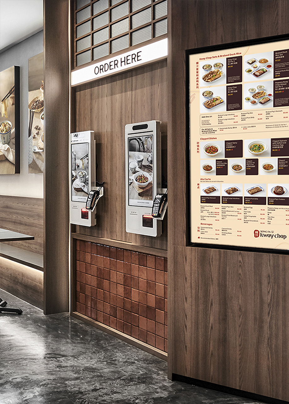
We're extremely grateful to Song Fa for trusting us again to create a brand identity for Song Fa Kway Chap that reflects their firm commitment to delivering authentic experiences for all ages to enjoy. If you're curiously keen, do check out our other works for Song Fa here.
Creative Direction, Art Direction & Design
OuterEdit
Graphic Design & Development
OuterEdit
Food Photography
Song Fa Kway Chap
Interior Design & Photography
Wee Studio Pte Ltd
